
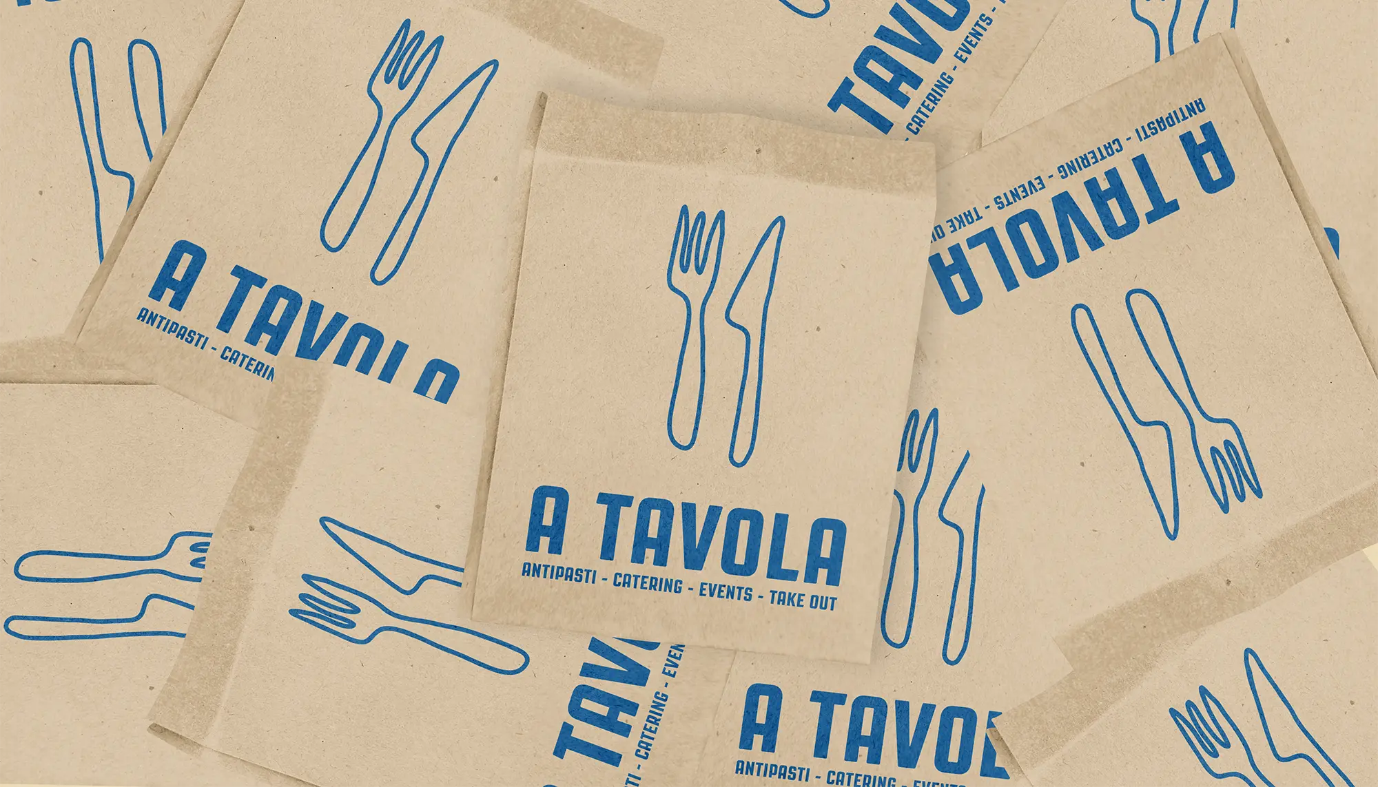

A Tavola is a vibrant, laid-back Italian bar in Algarve, Portugal, focused on uniting people through food and community. The challenge was to create a playful, hand-drawn aesthetic that remained cohesive and professional, balancing whimsy with modern appeal.
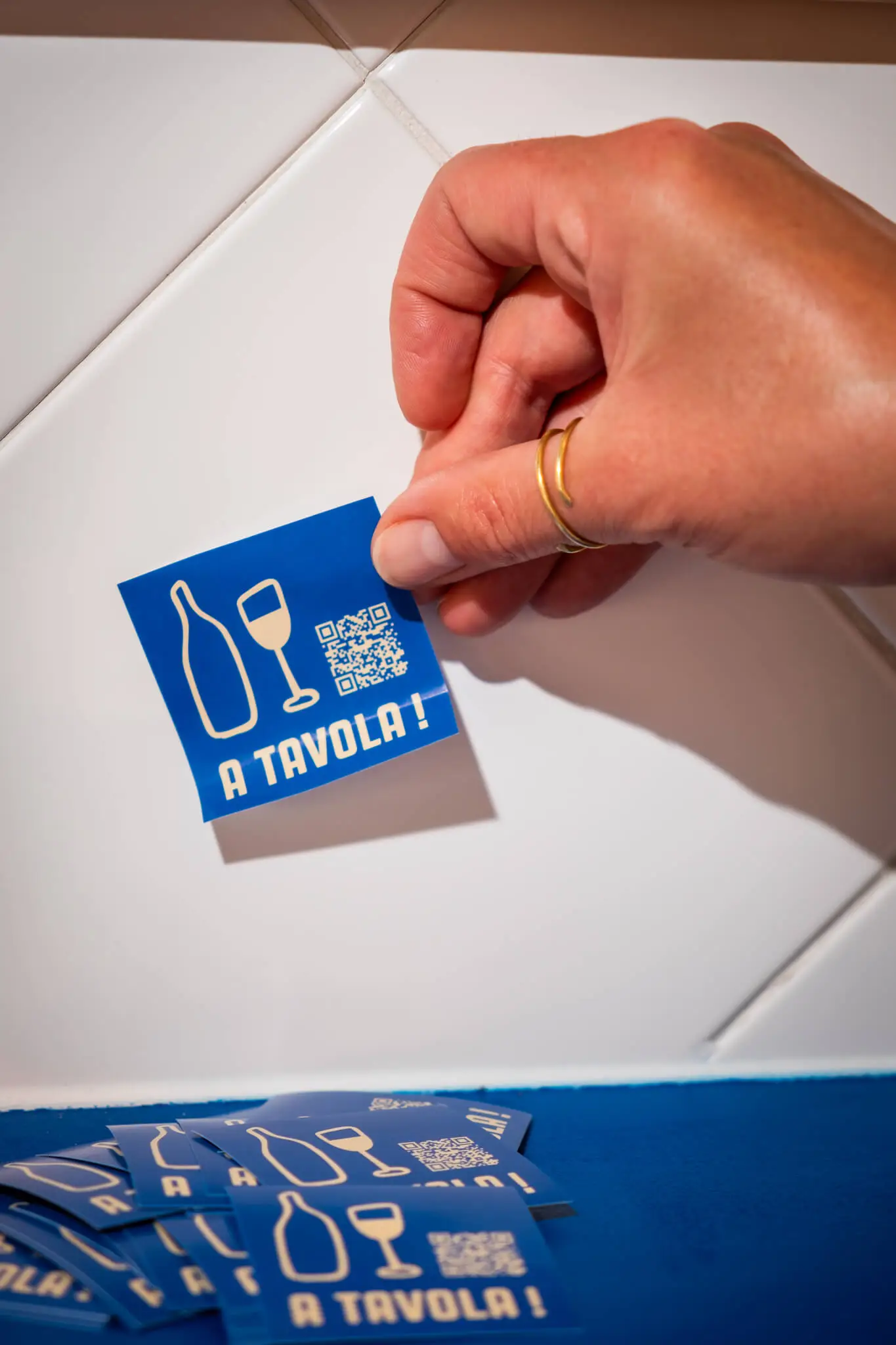
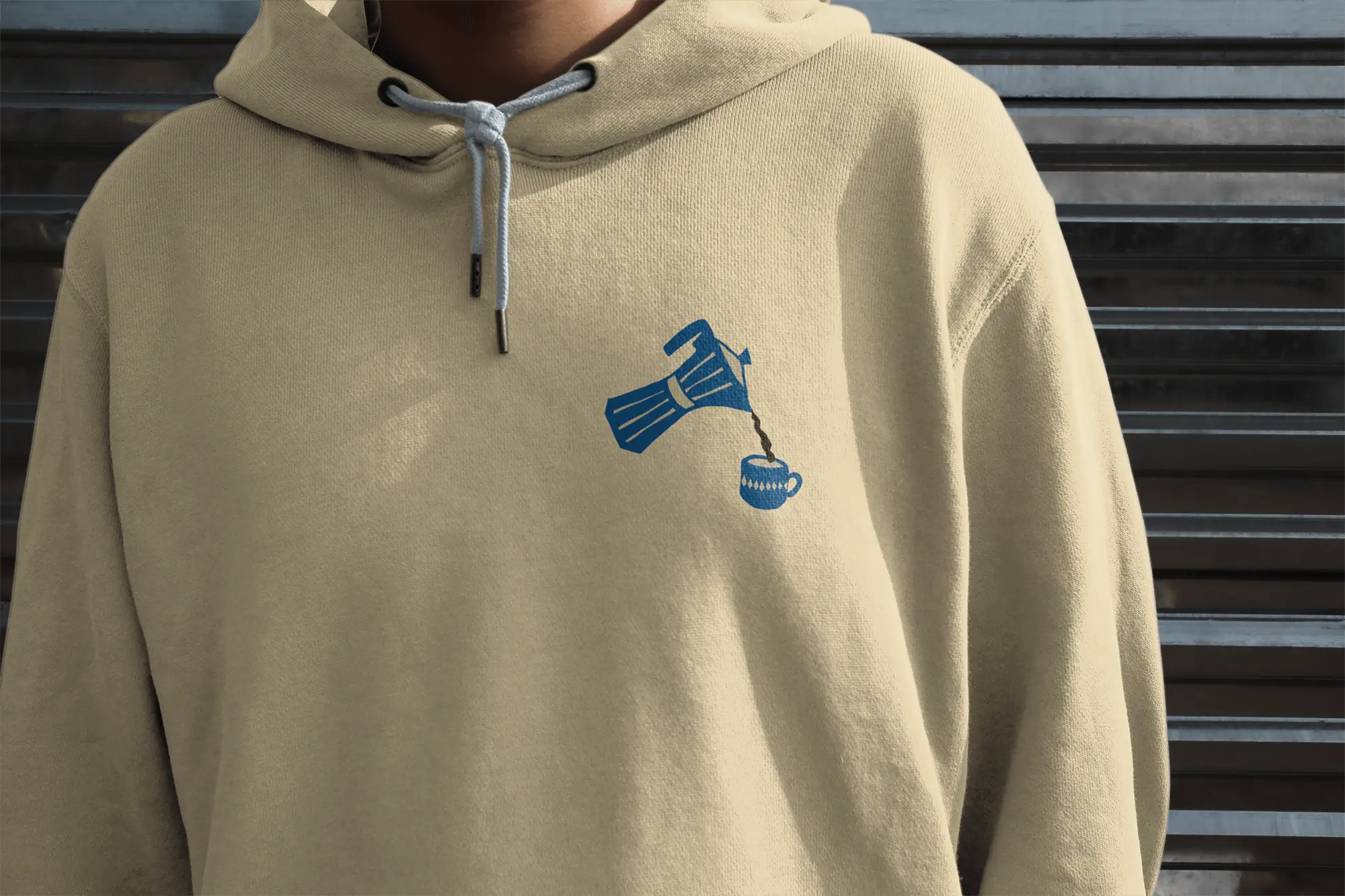
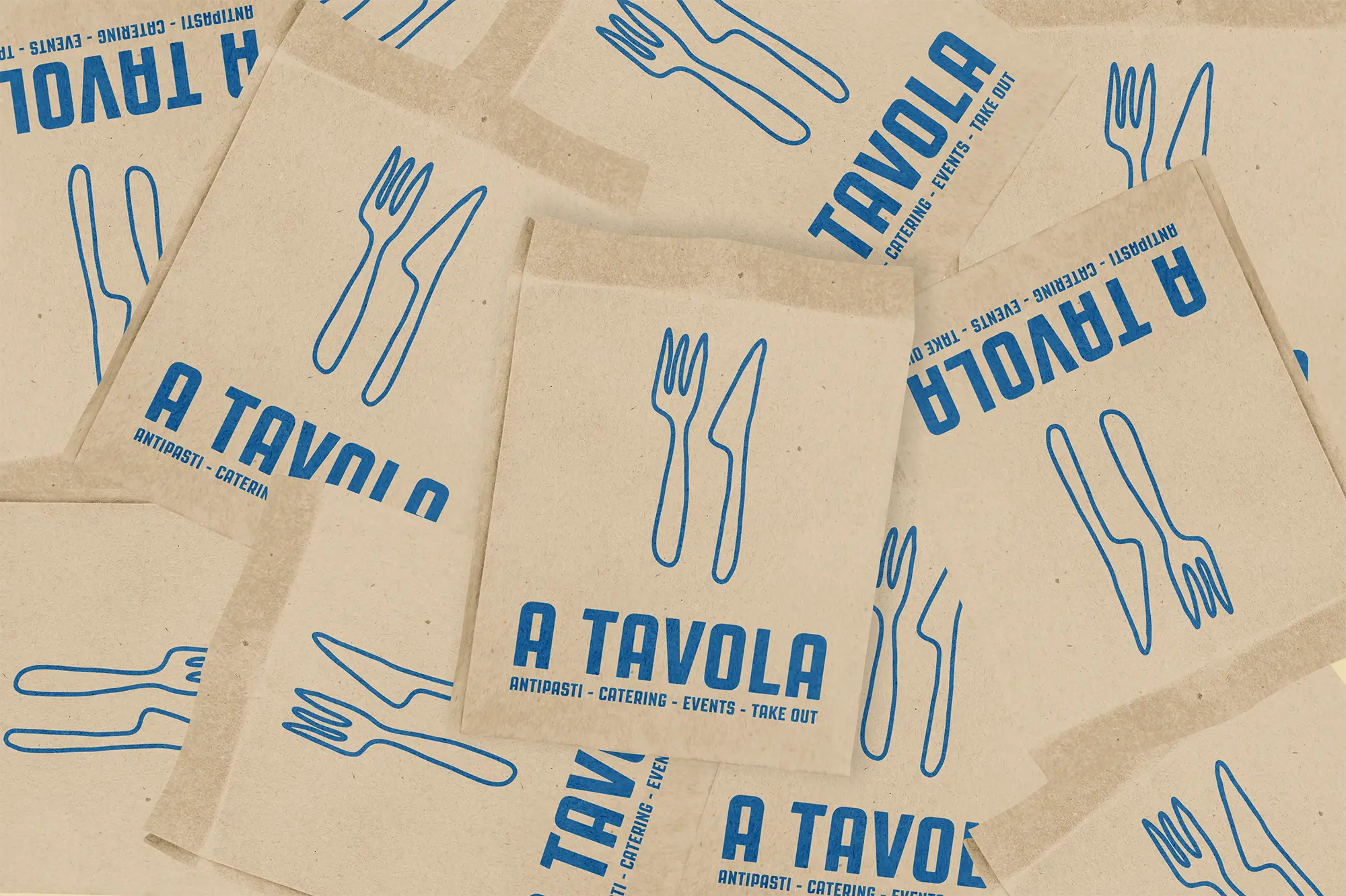
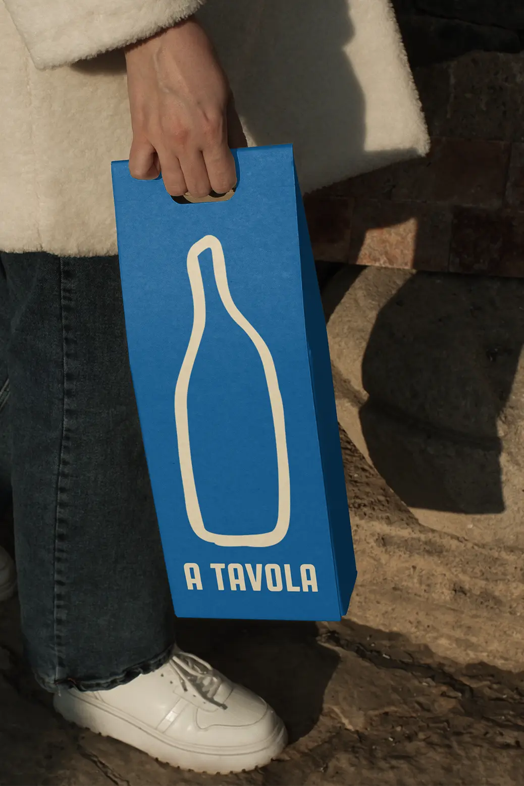
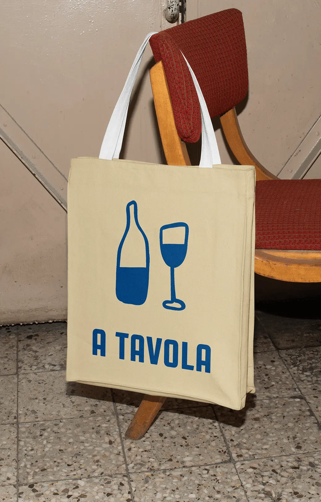
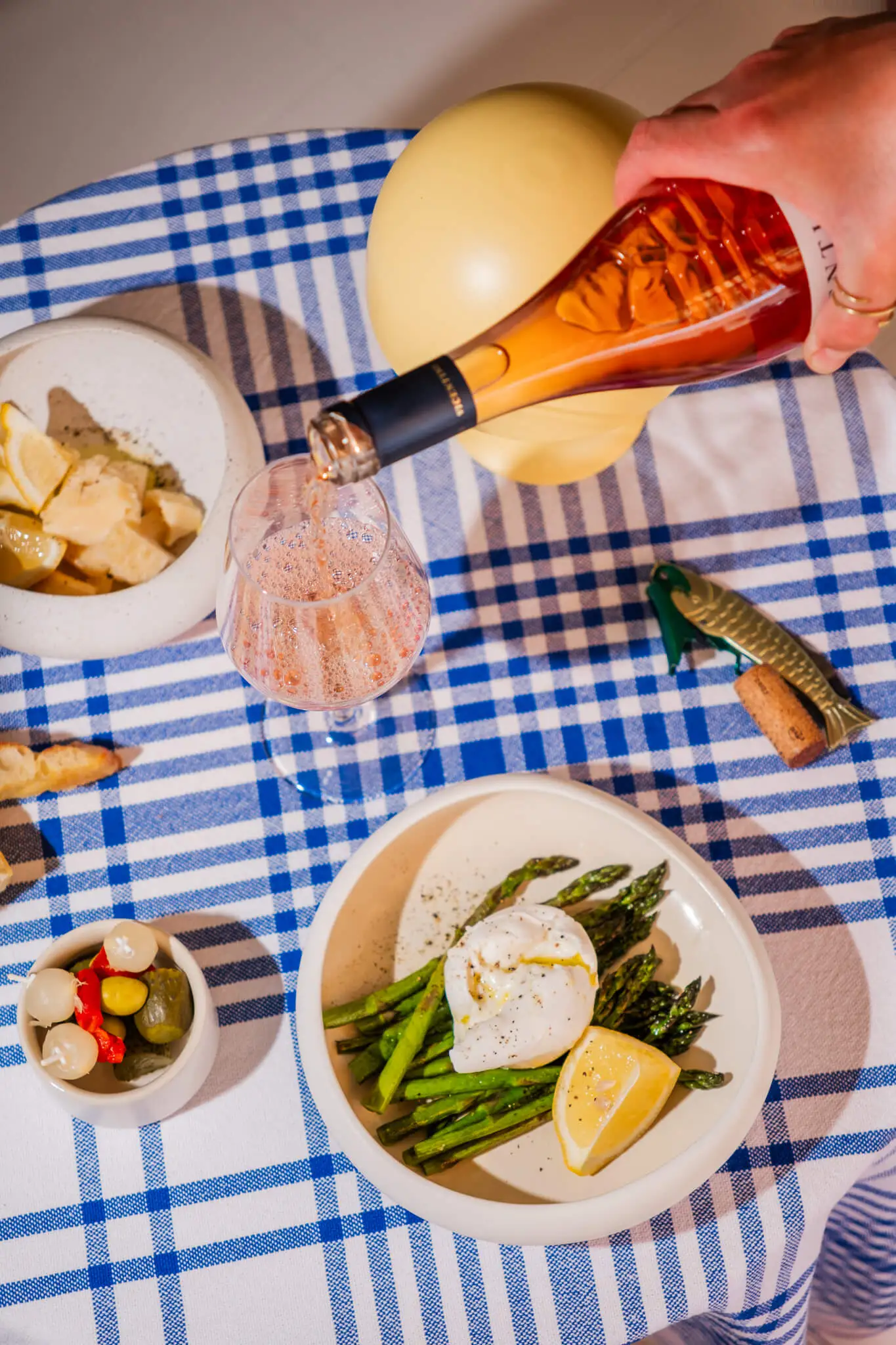
We identified the target audience’s desire for an approachable, youthful atmosphere which led to a design centered on vibrant but controlled colors, avoiding an overly busy look. The restaurant’s core - authentic cuisine - was represented using familiar symbols while reinforcing the casual, welcoming vibe through the hand drawn aspect of the logo. Coherent repetition of the brand elements brought a sense of professionalism and coherence to the overall concept.
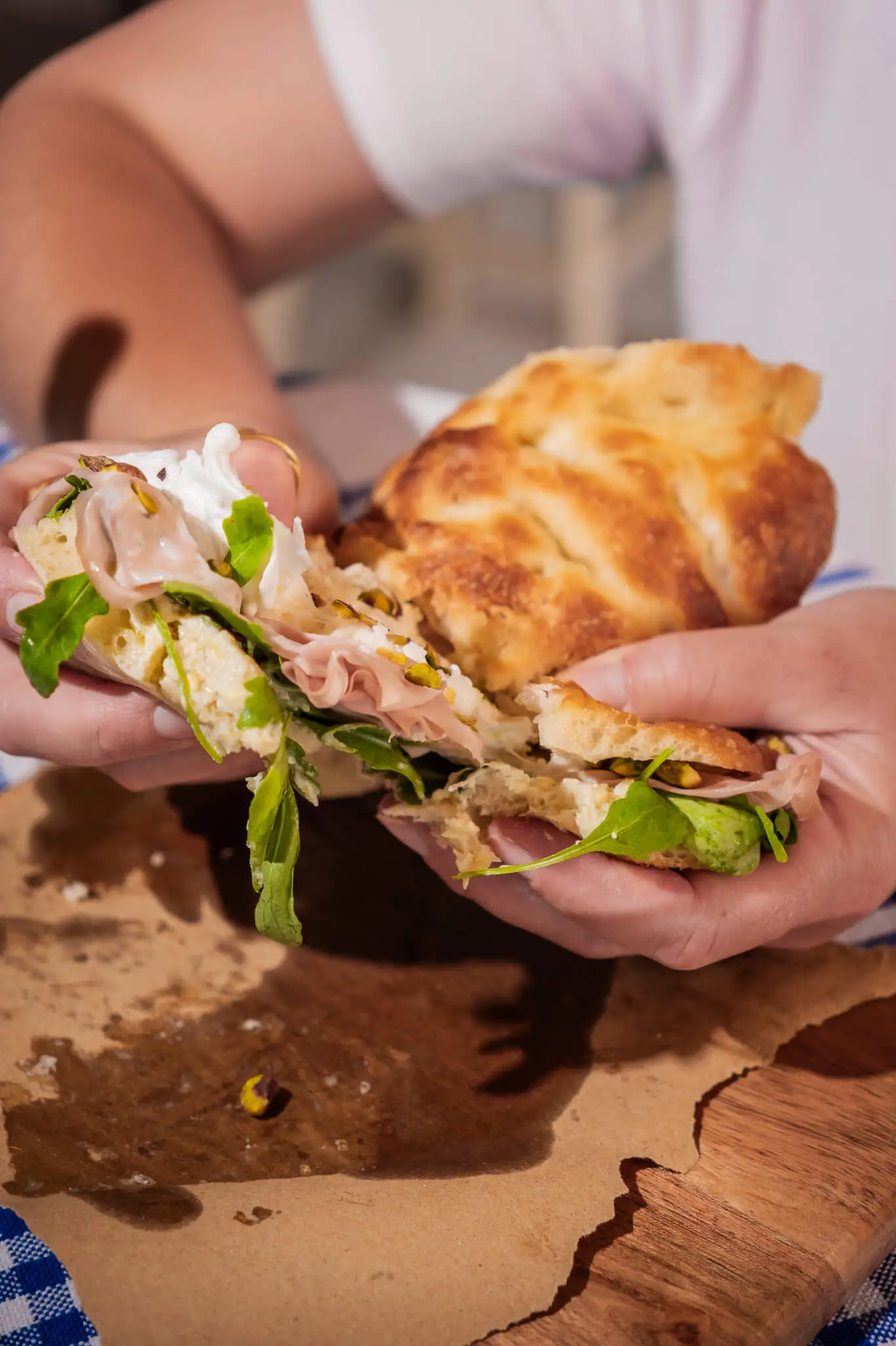
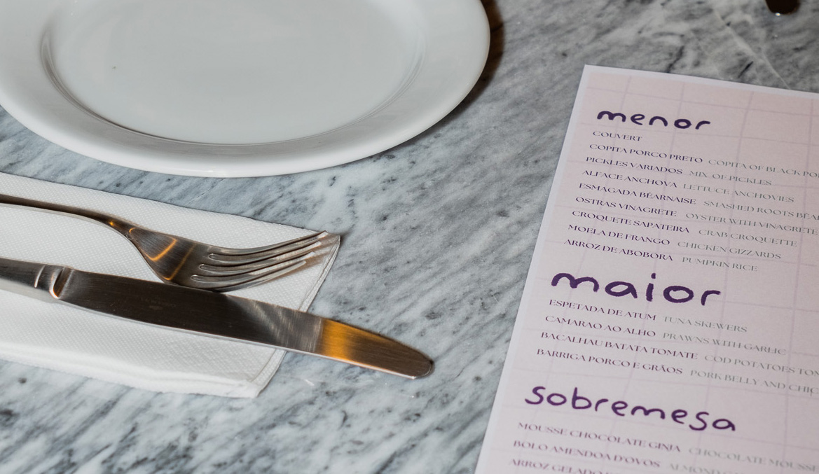
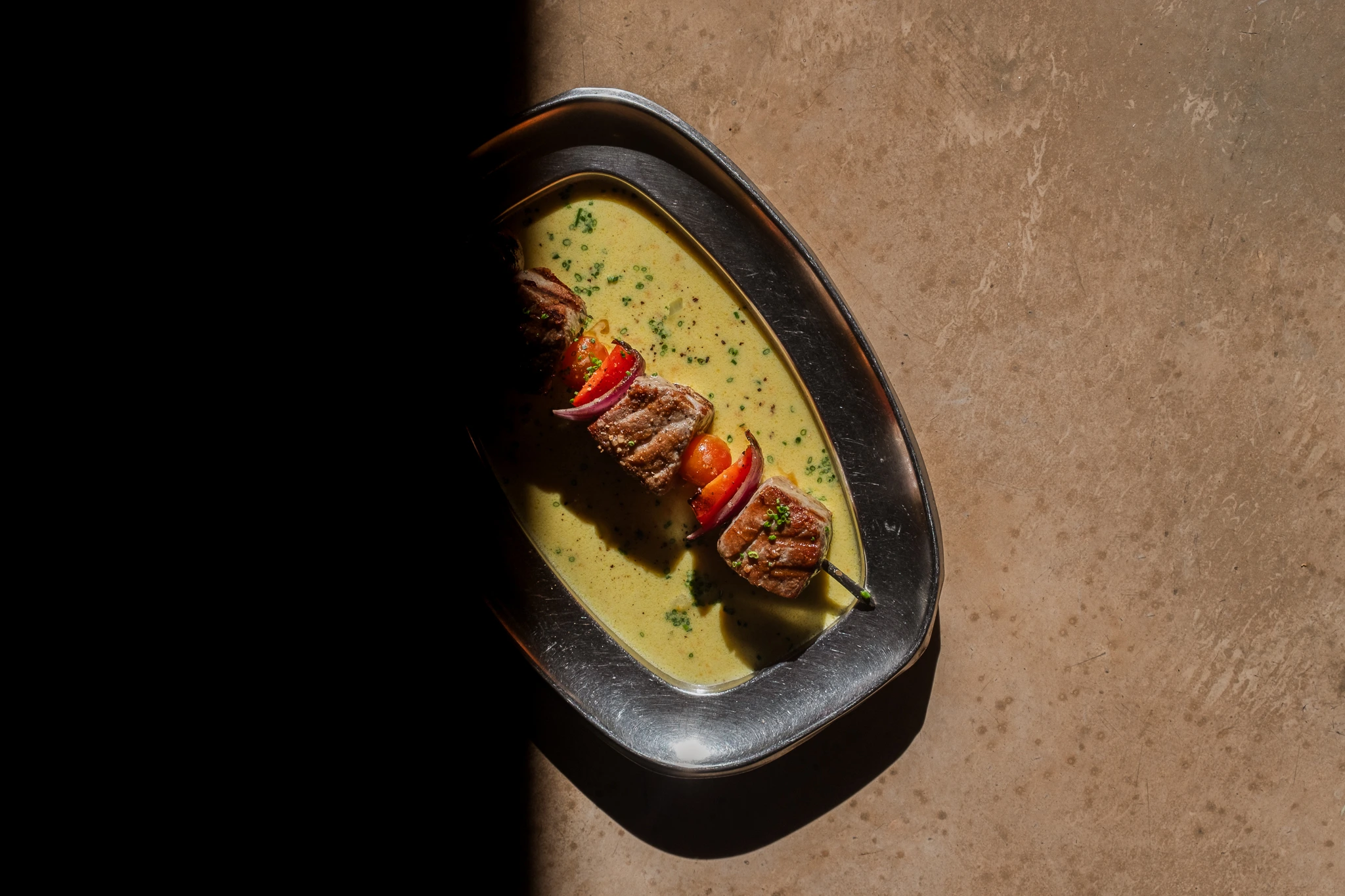
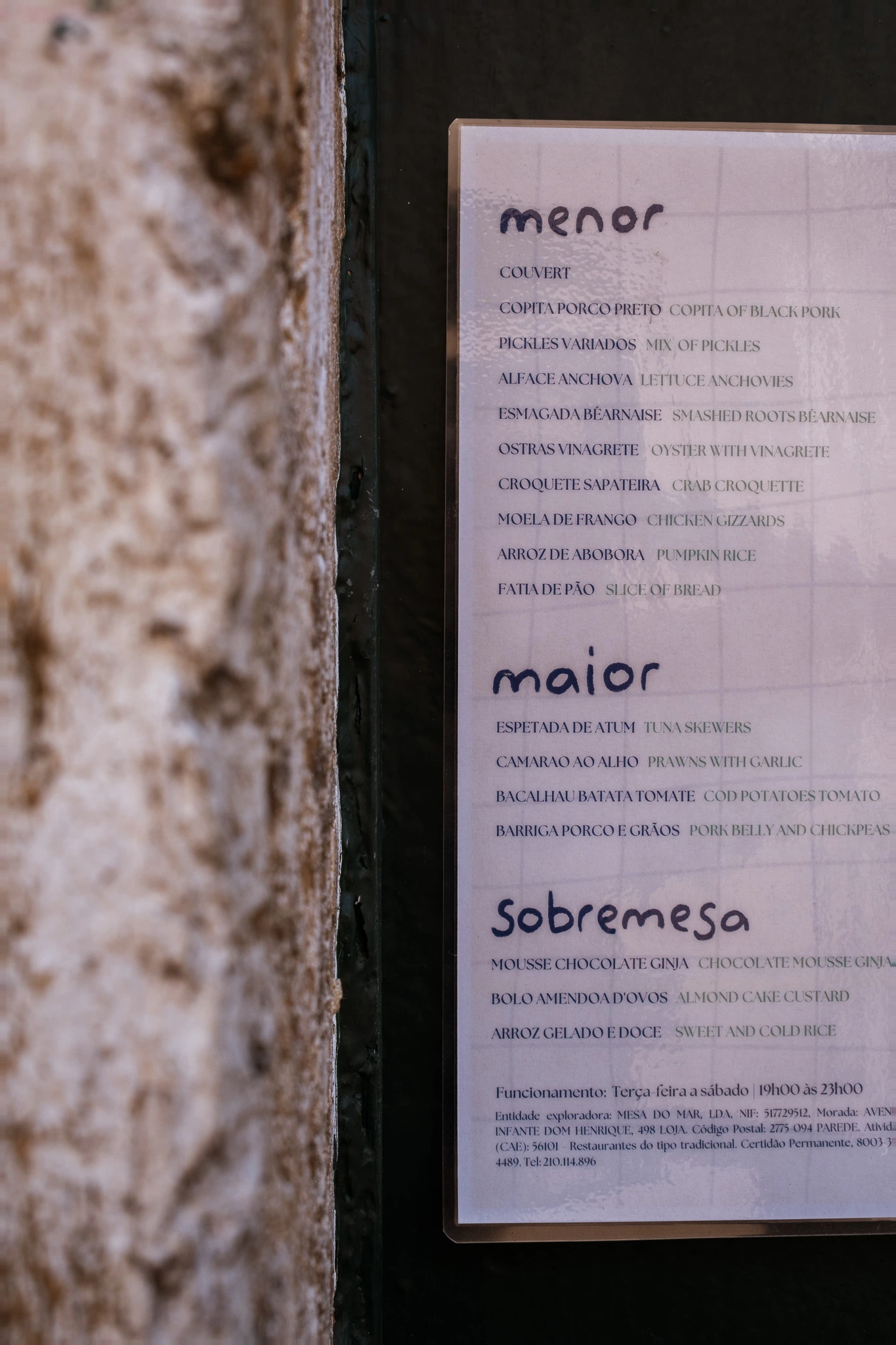
Meia-Porta embodies the fusion of tradition and modernity. Inspired by the heart of Portugal, we blend authentic flavors with contemporary twists, creating a unique culinary experience that honors the rich heritage of Portuguese cuisine while embracing innovation.
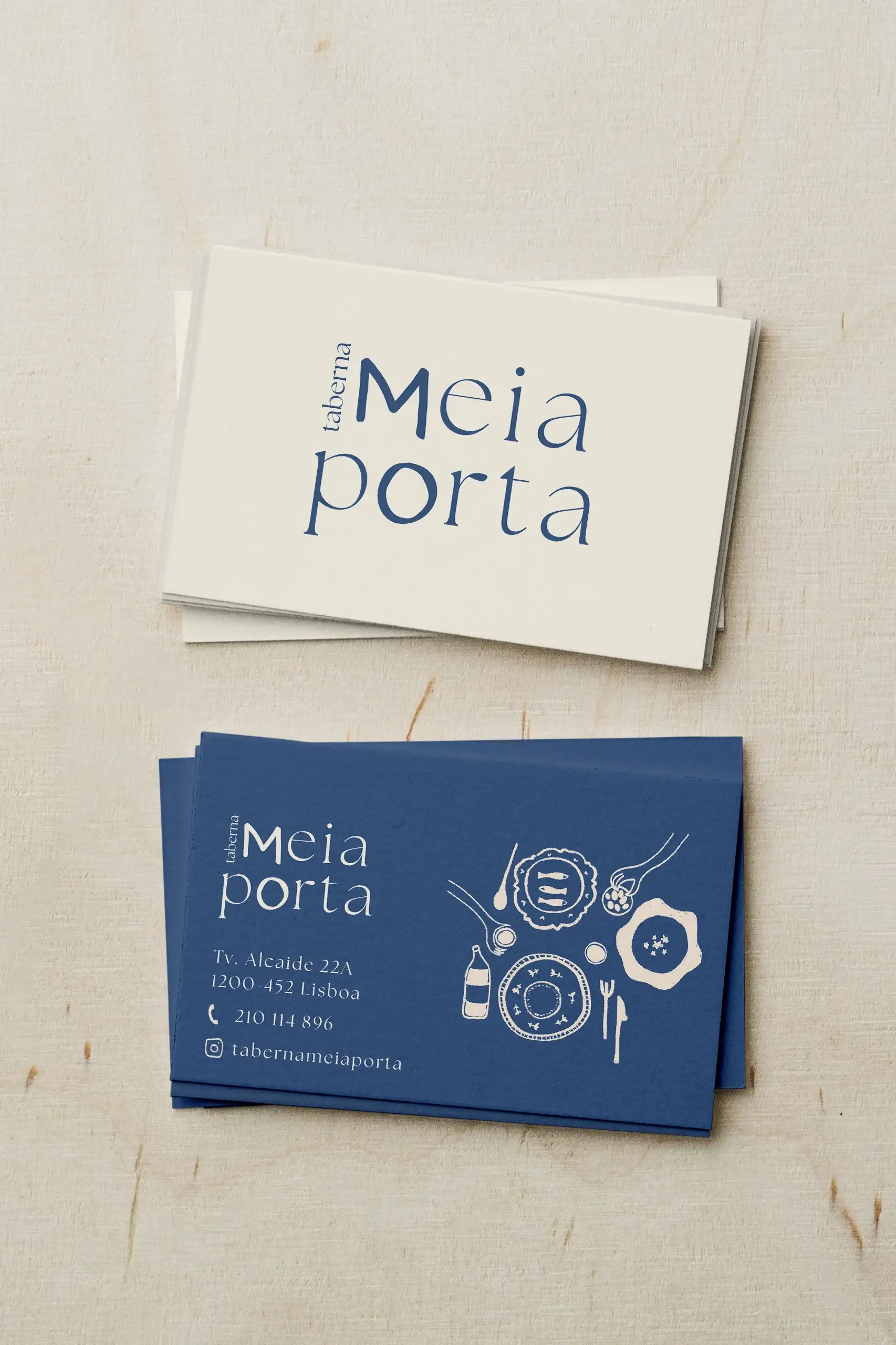
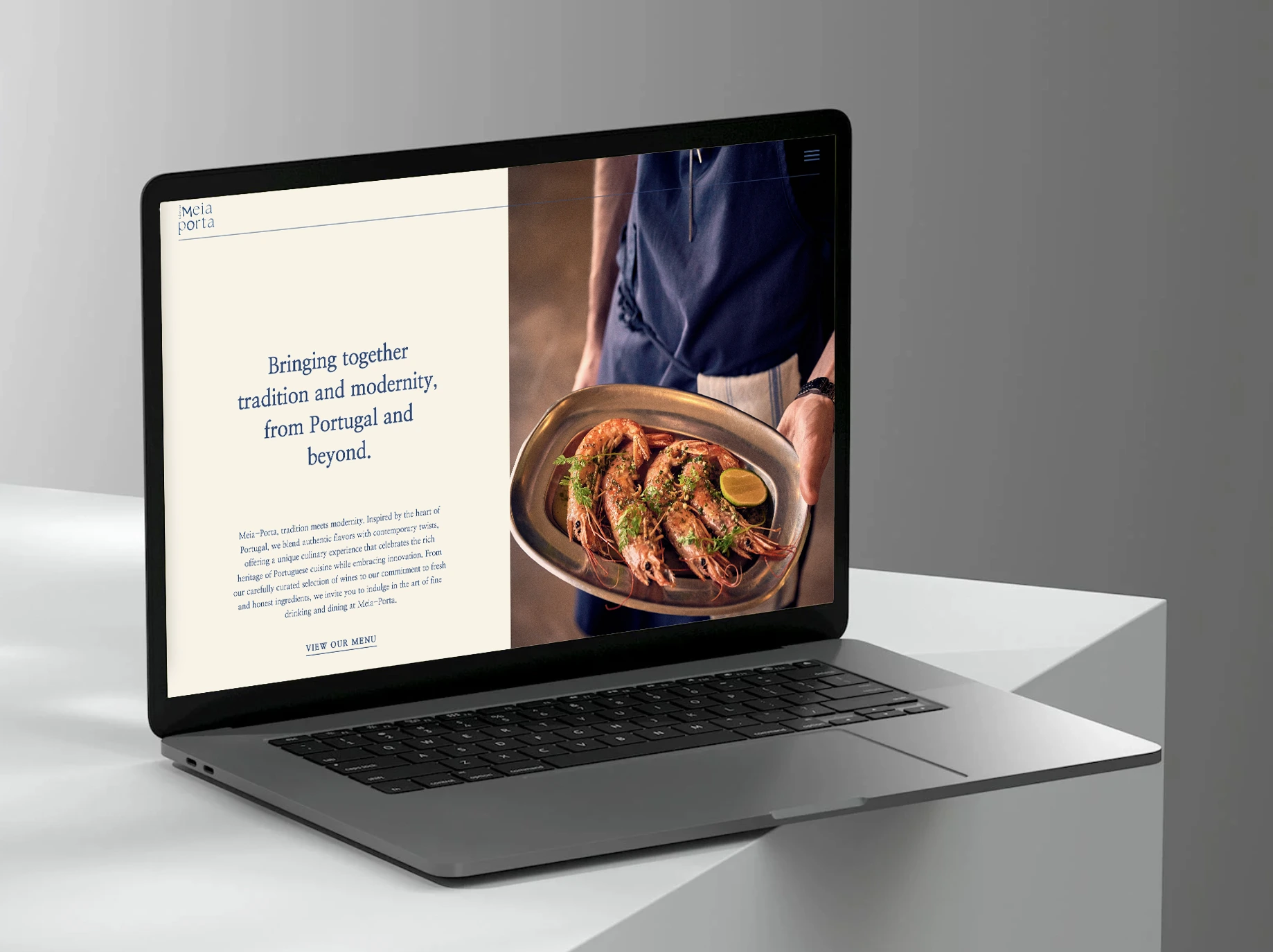
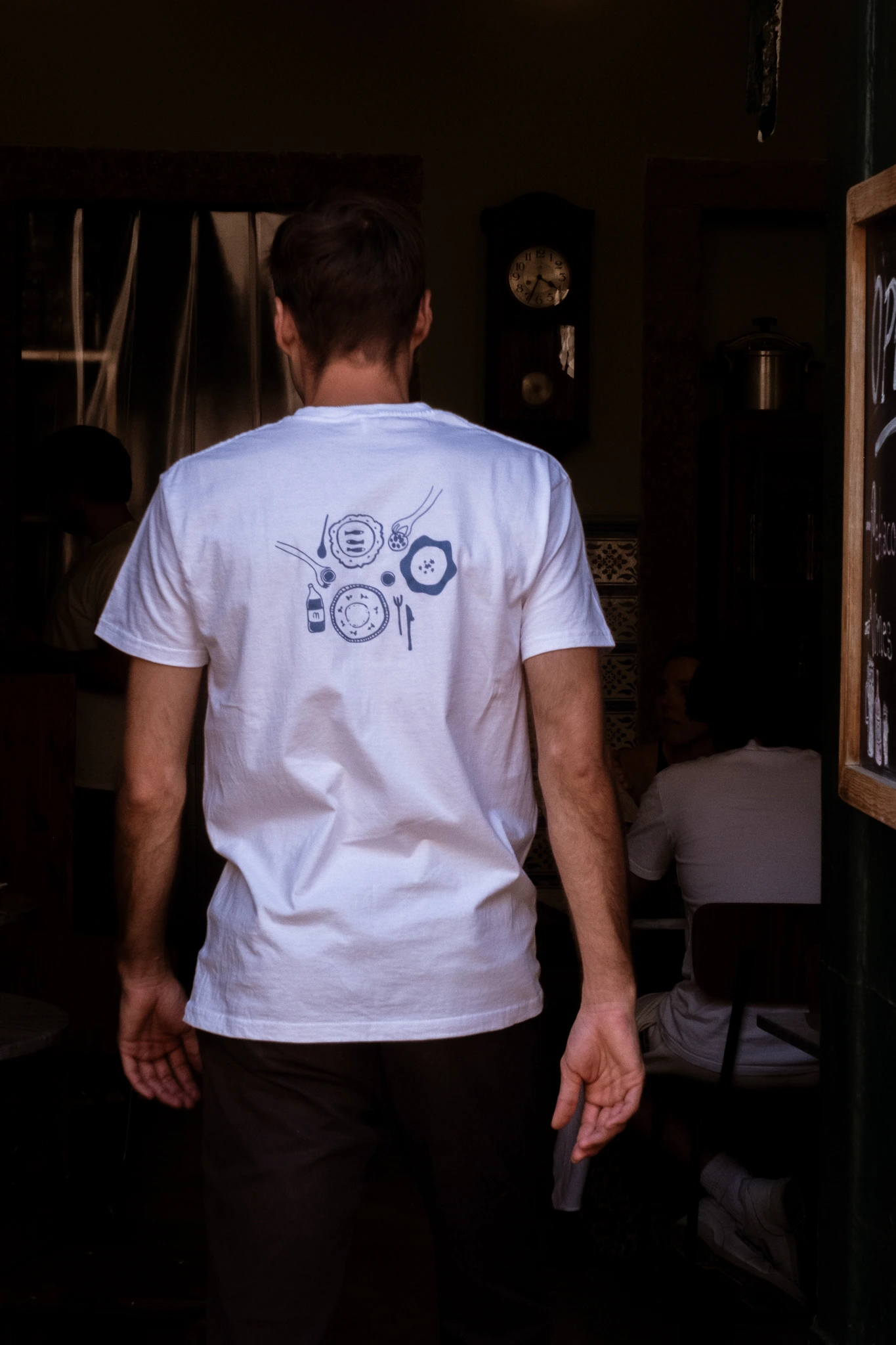
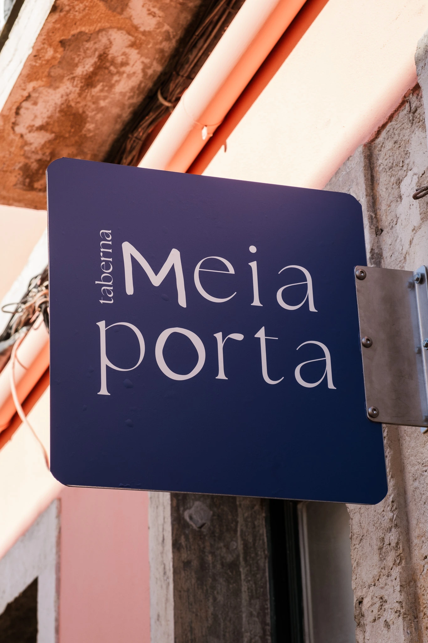
In designing the identity, I drew from the vibrant blue of traditional Portuguese azulejos, reflecting the laid-back essence of the culture. The wordmark marries an elegant serif font with hand-drawn letters, capturing the playful yet refined spirit of the brand. This combination conveys the blend of tradition and elegance inherent in the flavors offered.
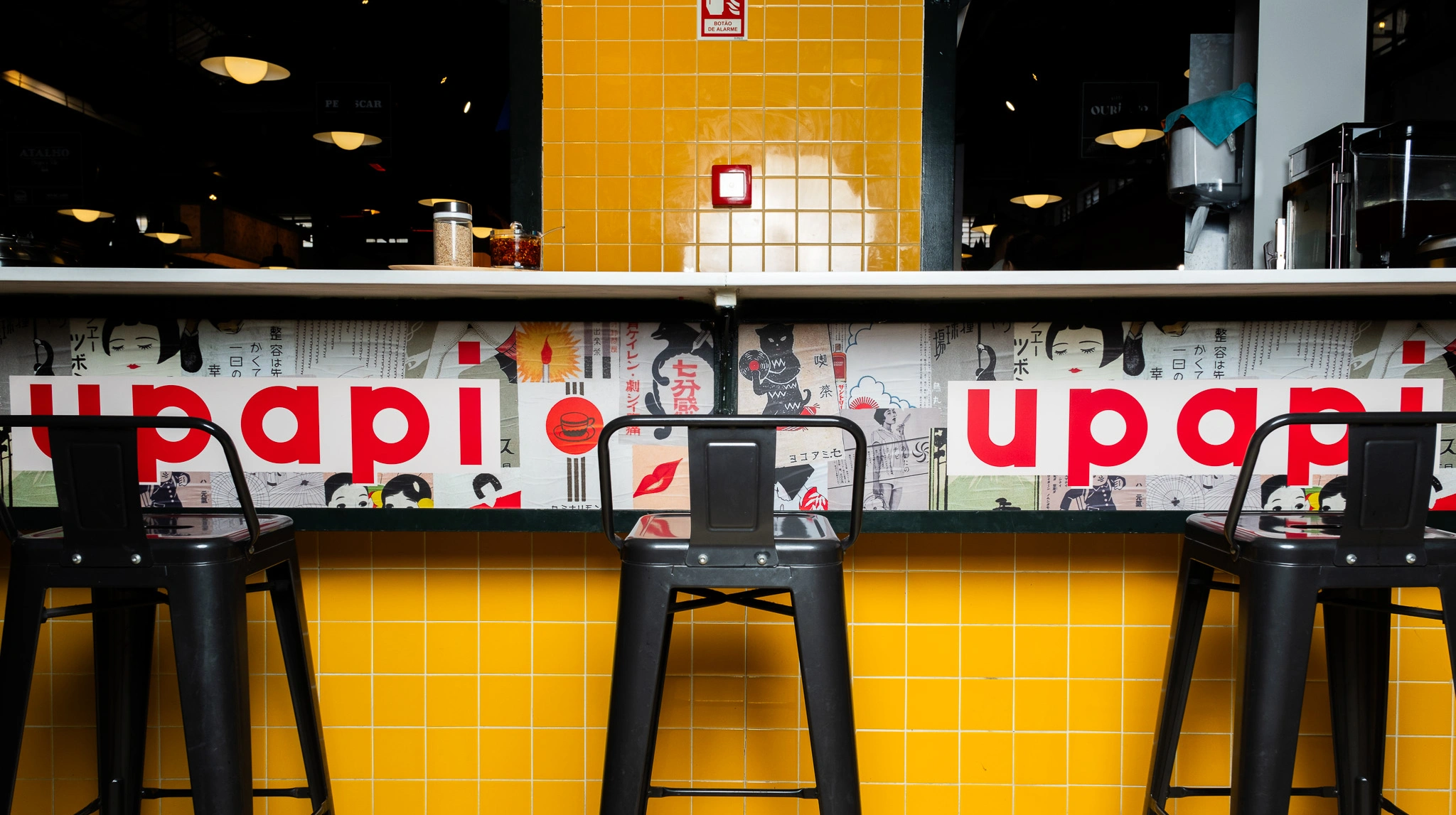
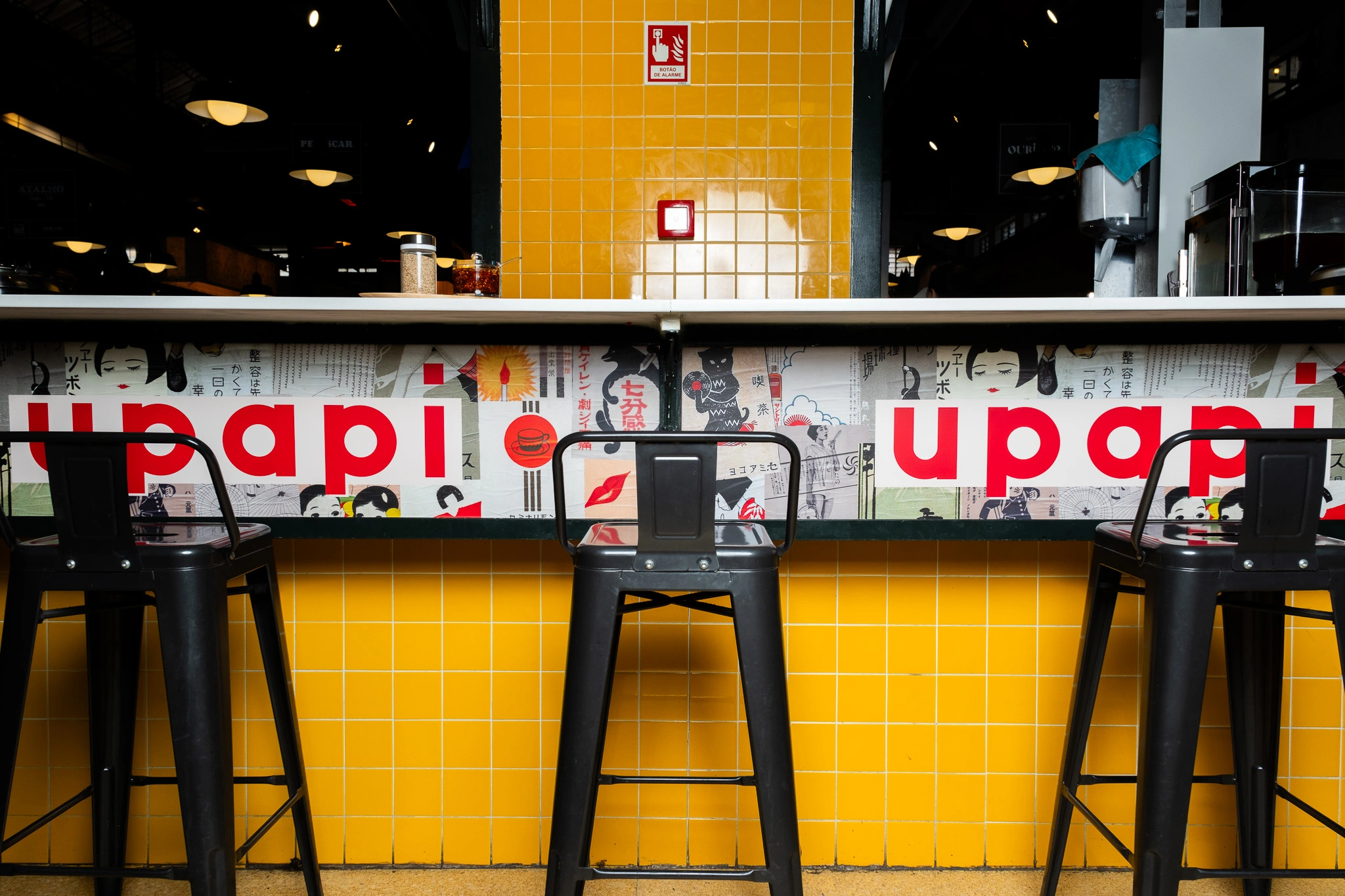
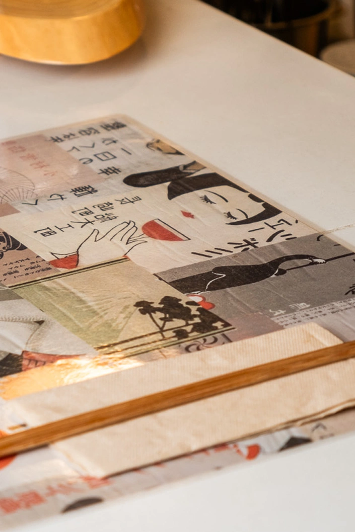
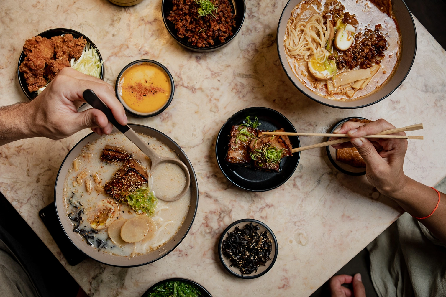
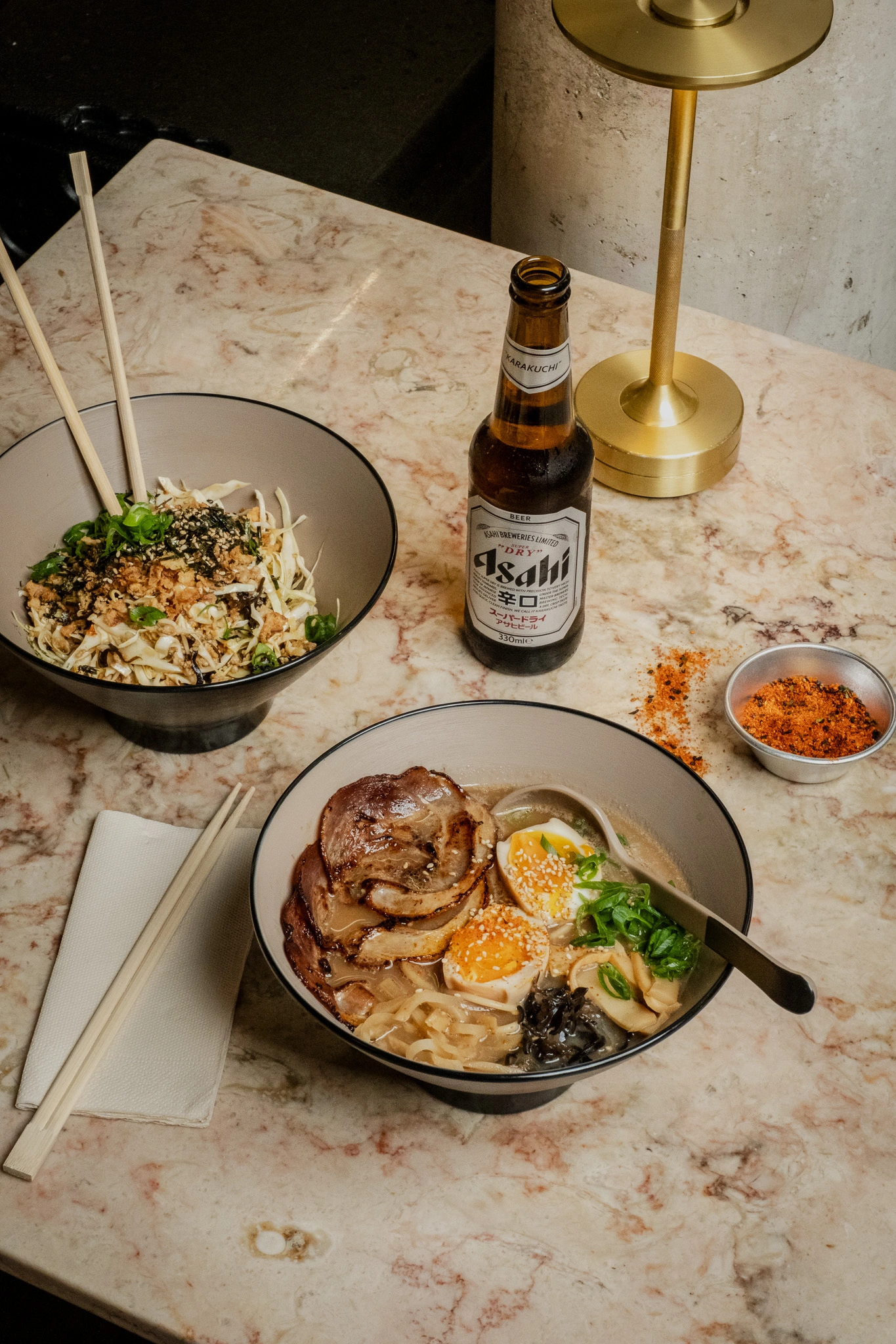
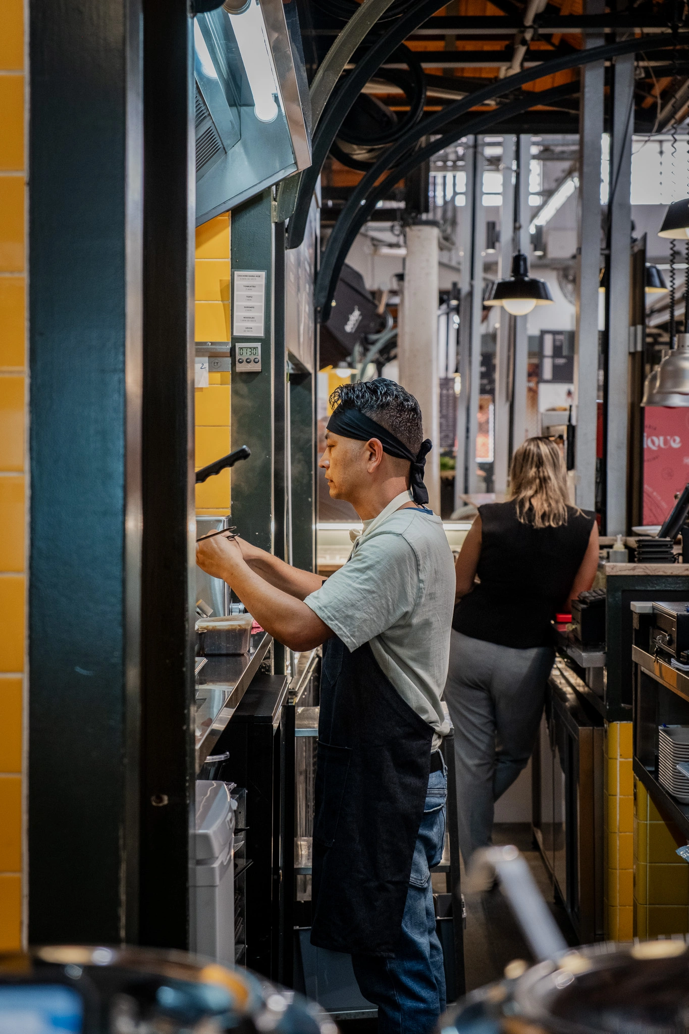
Upapi is a vibrant Japanese udon store nestled within Mercado de Campo de Ourique in Lisbon, offering a youthful twist on the traditional udon experience. The challenge was to blend traditional Japanese motifs with sleek, modern design elements while maintaining a playful, approachable feel.
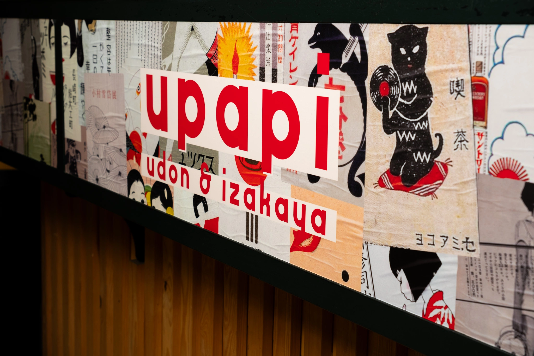
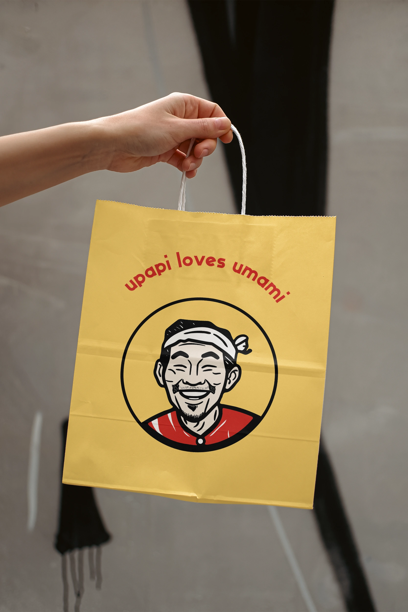
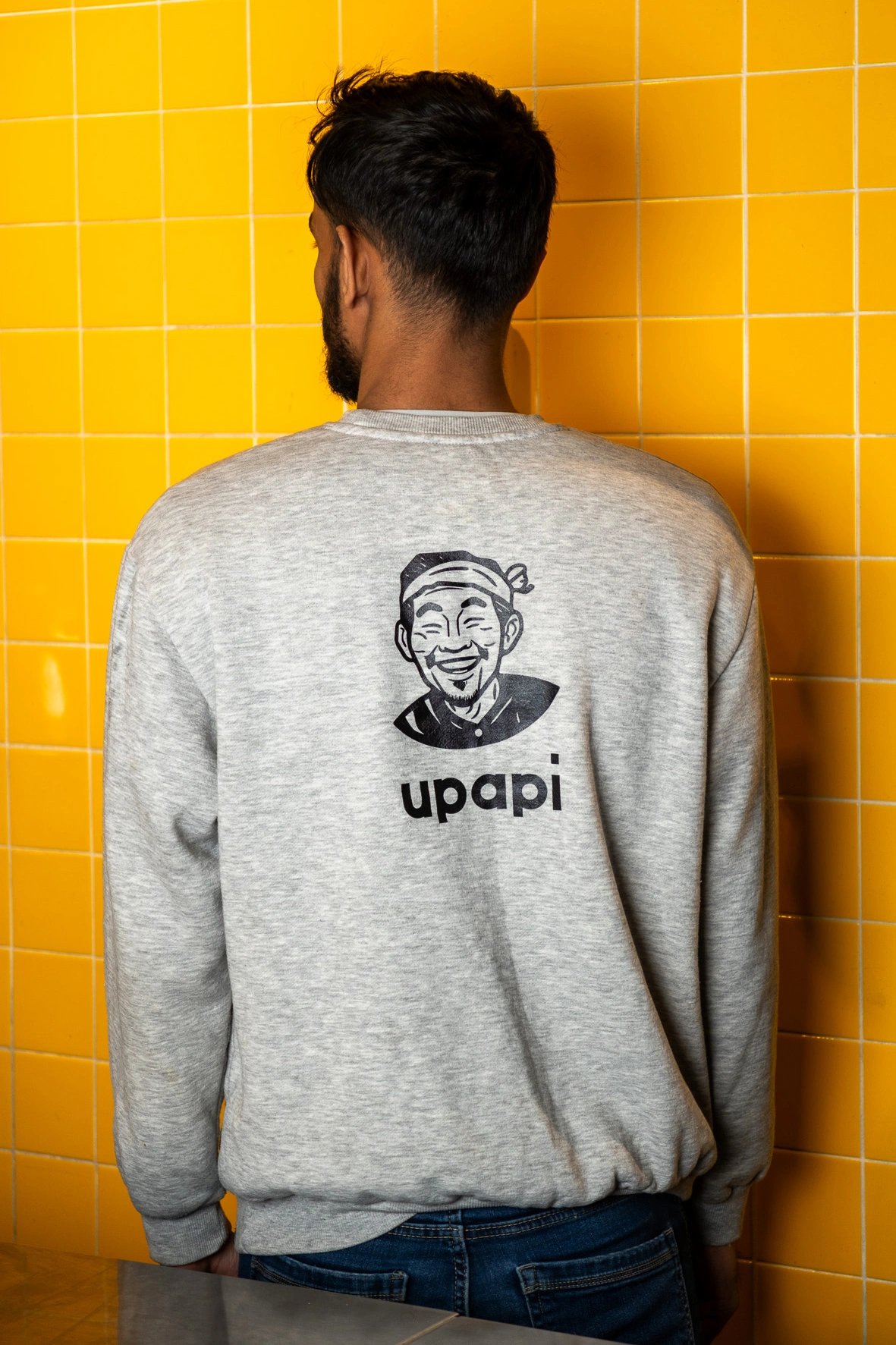
To achieve this, I incorporated vintage Japanese matchbox labels, which brought a sense of nostalgia and playfulness to the design. These elements were combined with contemporary typography and clean lines, creating a fusion of past and present that felt both fresh and authentic. This thoughtful balance between tradition and modernity, guided by the audience's appreciation for cultural authenticity, helped shape the visual identity and overall concept.
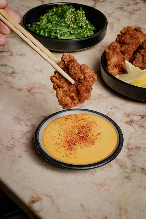
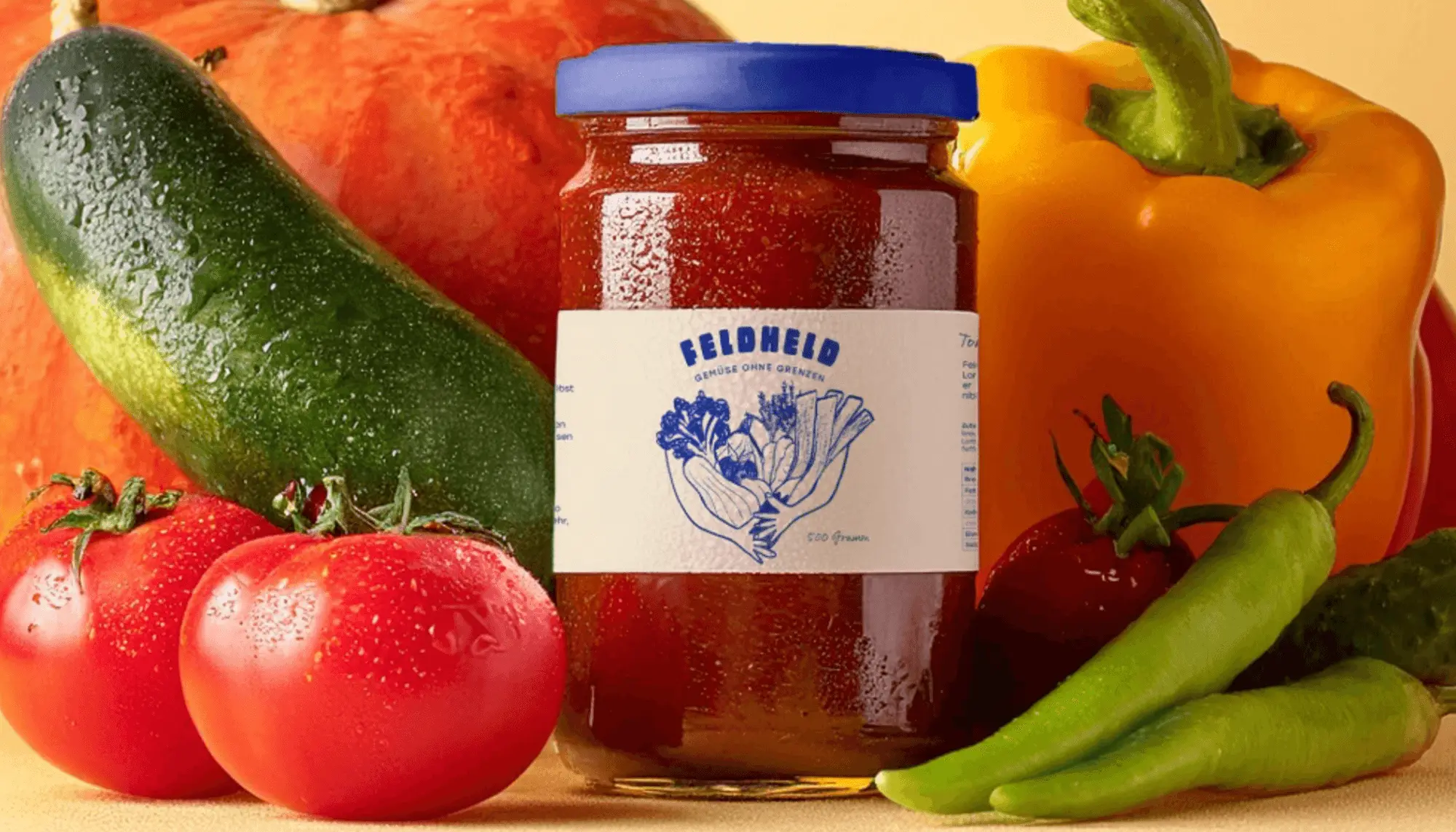
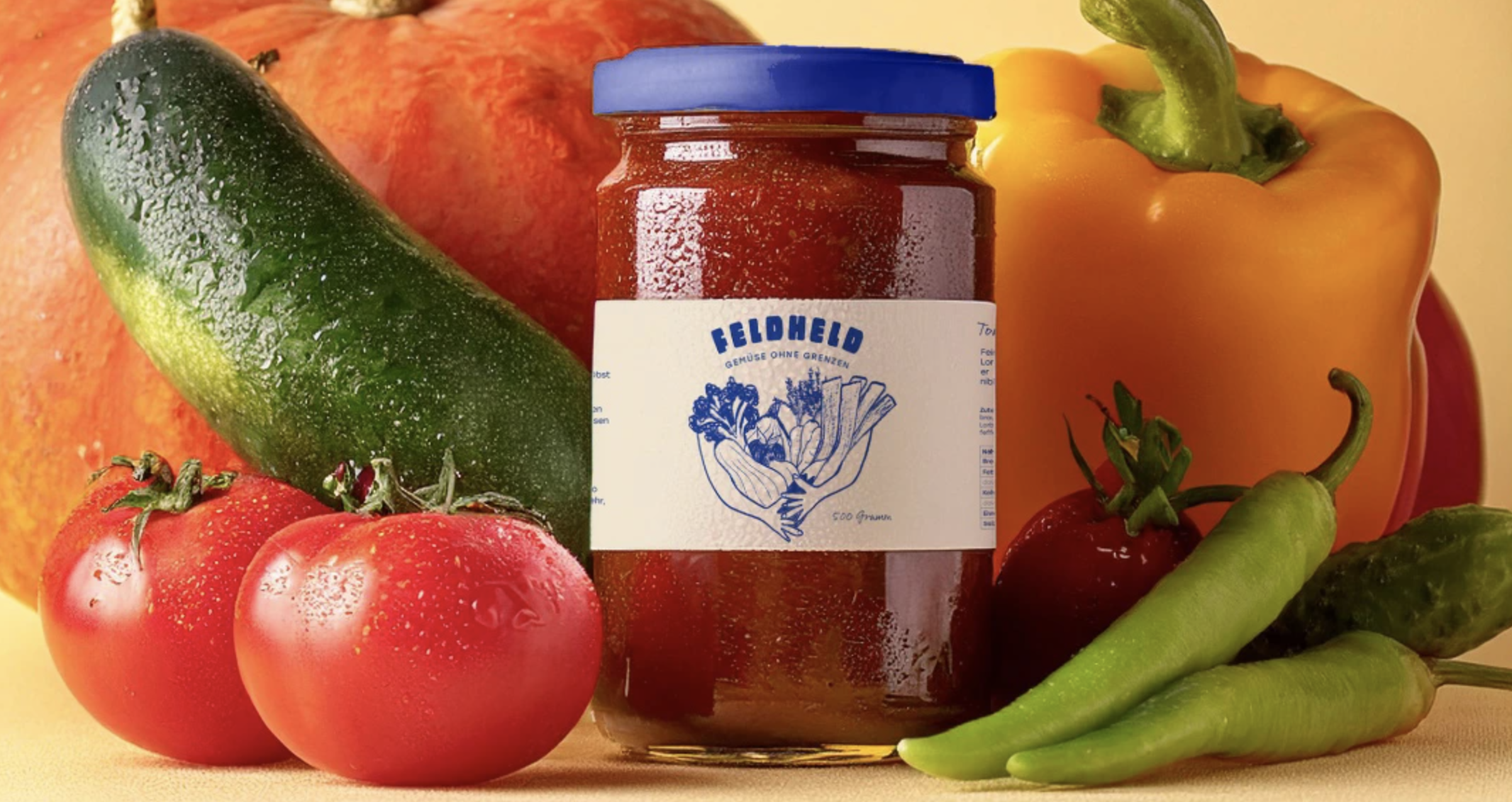
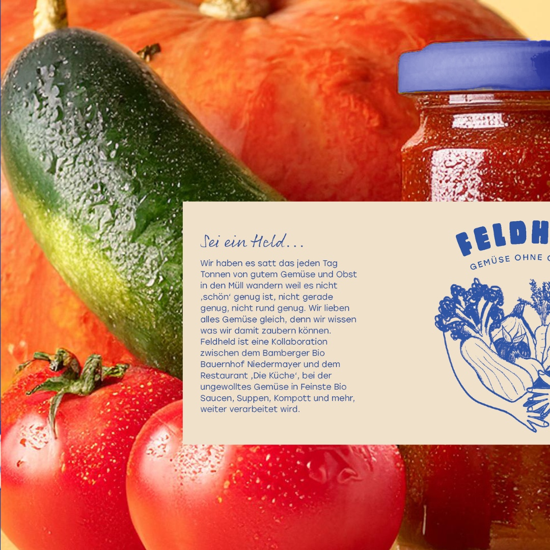
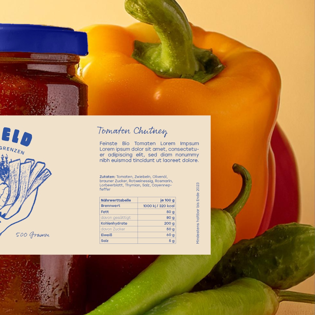
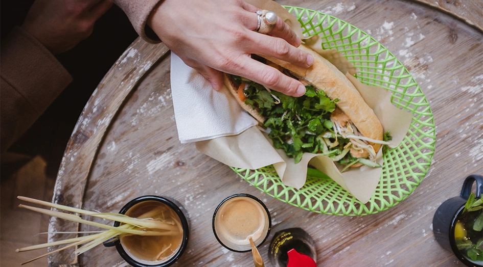

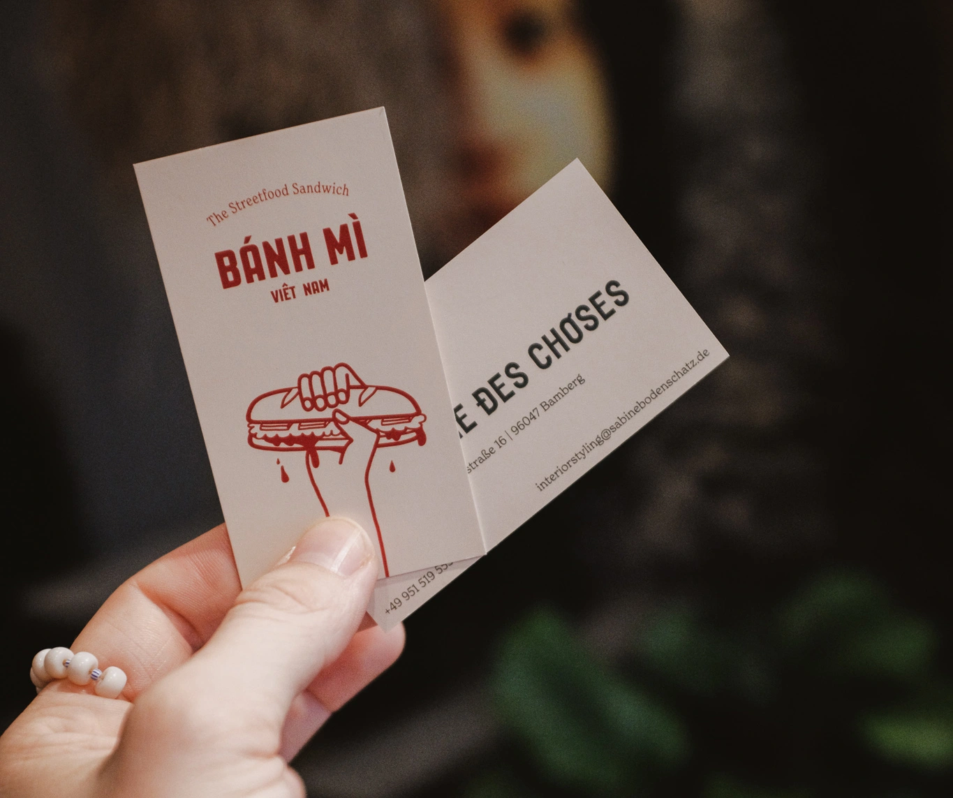
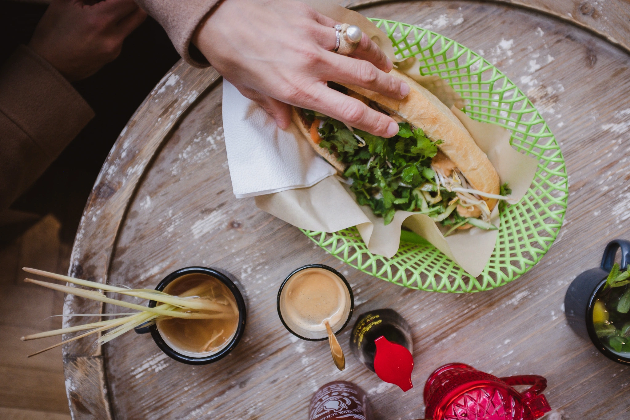
nspired by Vietnamese-French colonial interior design, Pharmacie des Choses is an 'Eat and Shop' concept where customers can browse tastefully curated furniture and decorative items while enjoying culinary delights. The challenge was to create two distinct yet harmonious brand identities that could coexist within the same space—one for the boutique store and one for the Bánh Mì café.
For Pharmacie des Choses, we developed a sophisticated design that draws on vintage French colonial aesthetics, using refined typography and elegant design elements to match the store's curated selection of home goods. In contrast, the branding for Bánh Mì brings a playful, inviting energy. Hand-drawn elements—such as illustrations of fresh ingredients, street vendors, and iconic Vietnamese scenes—give the brand an approachable, artisanal feel. These hand-drawn motifs reinforce the connection to the authentic Bánh Mì experience while maintaining a cohesive aesthetic within the overall store concept.
 Text Link
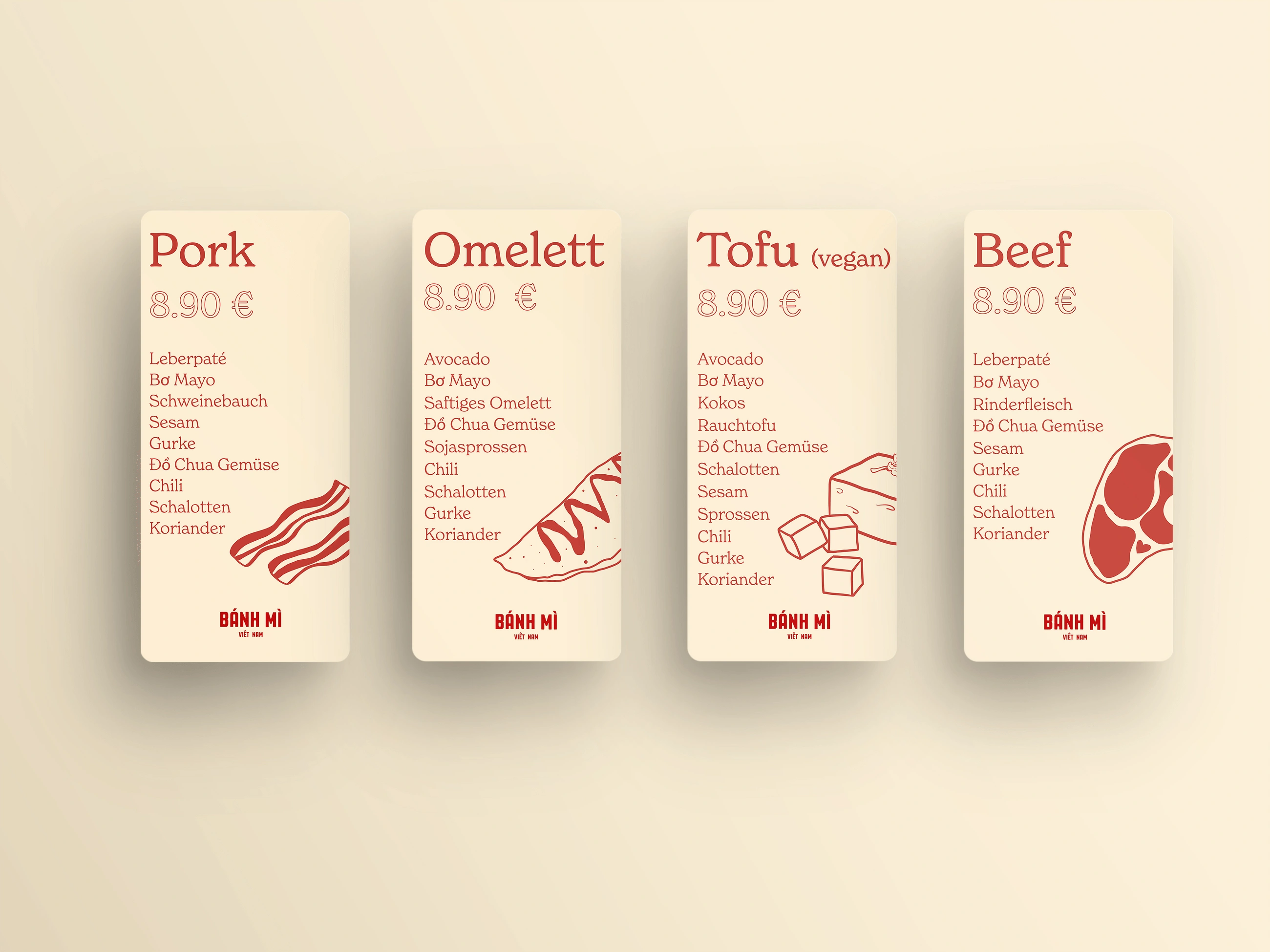
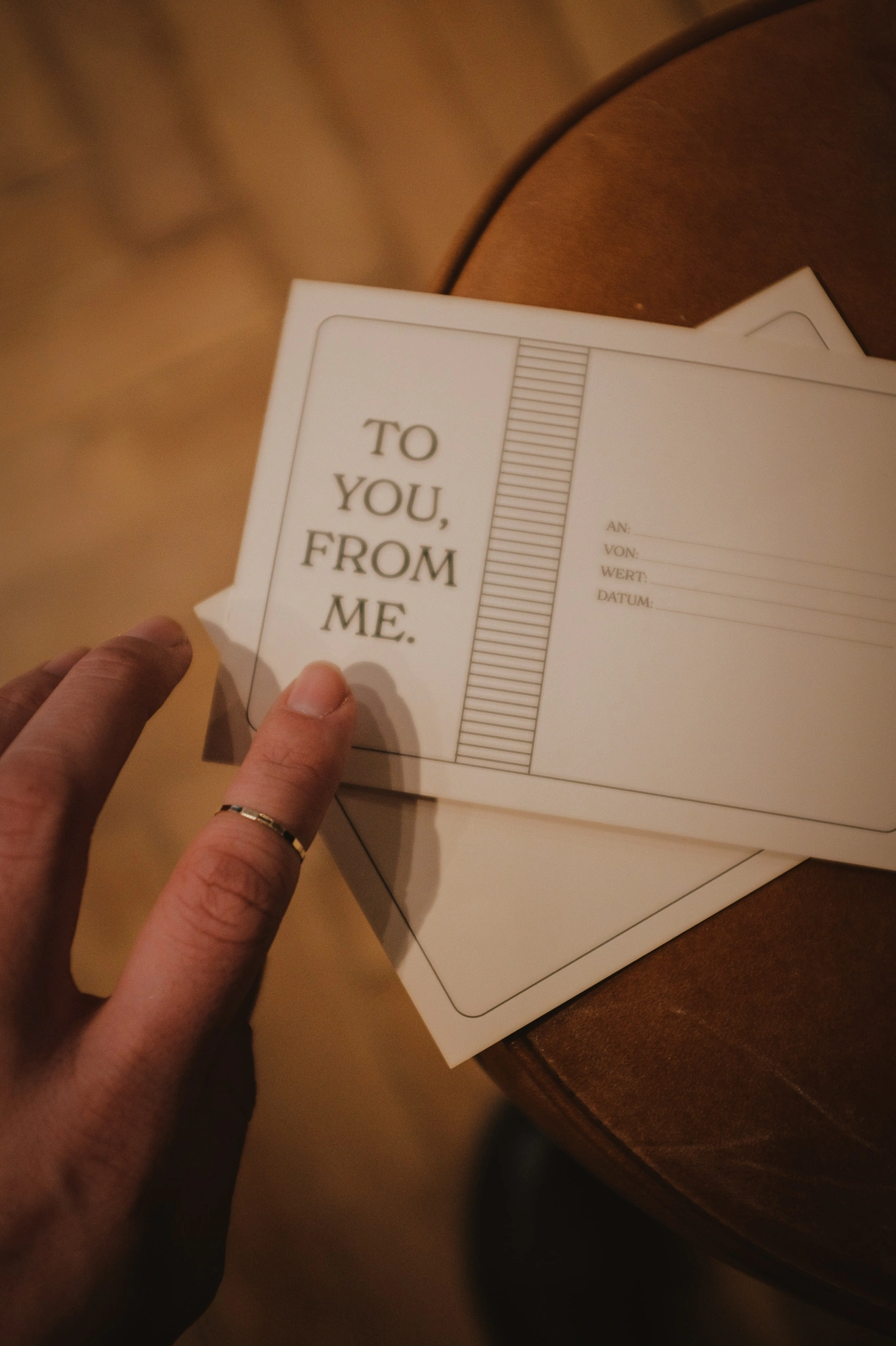
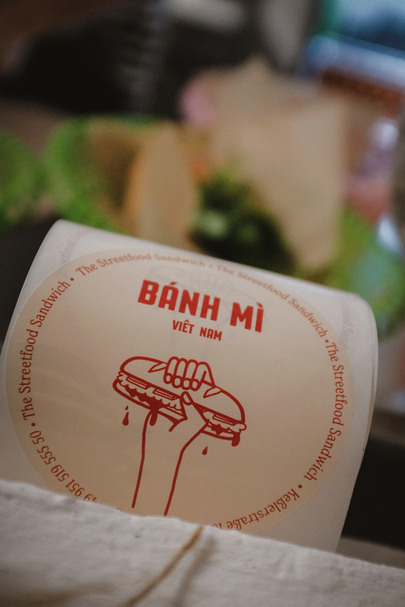


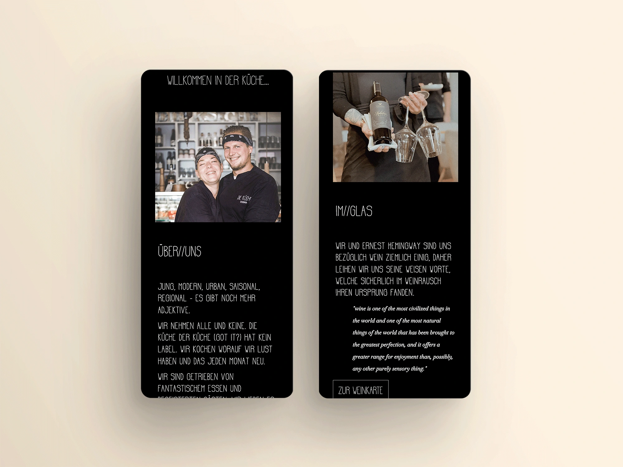
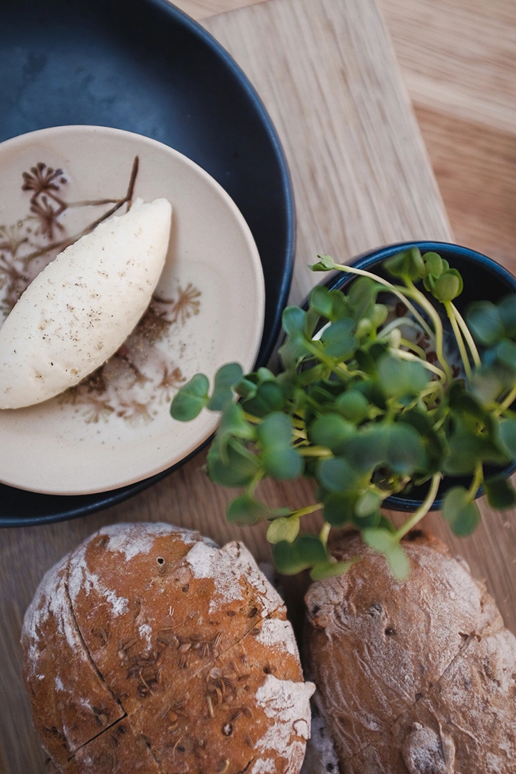
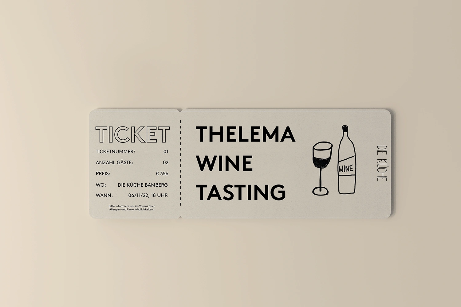
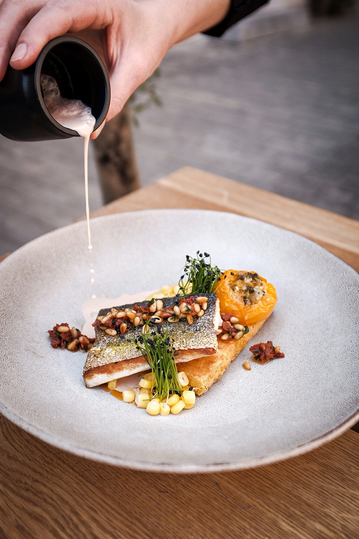
The gastronomic concept targets bon vivants and cosmopolitans who appreciate high-quality food and wine in a minimalist yet homely atmosphere. The challenge was to create a brand identity that reflects this unique blend of sophistication and warmth.

 Go to website
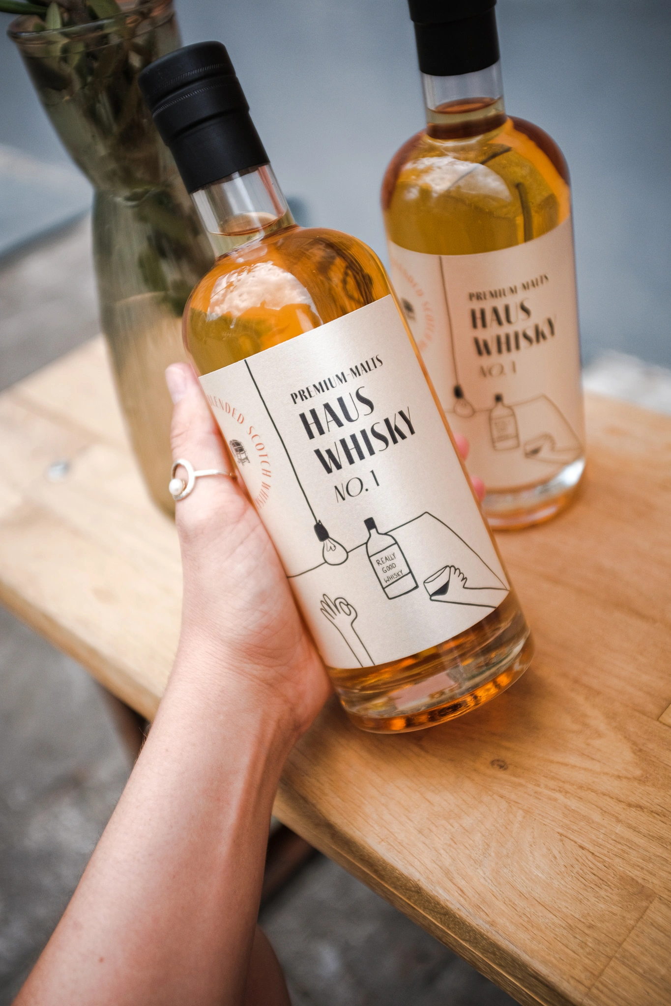
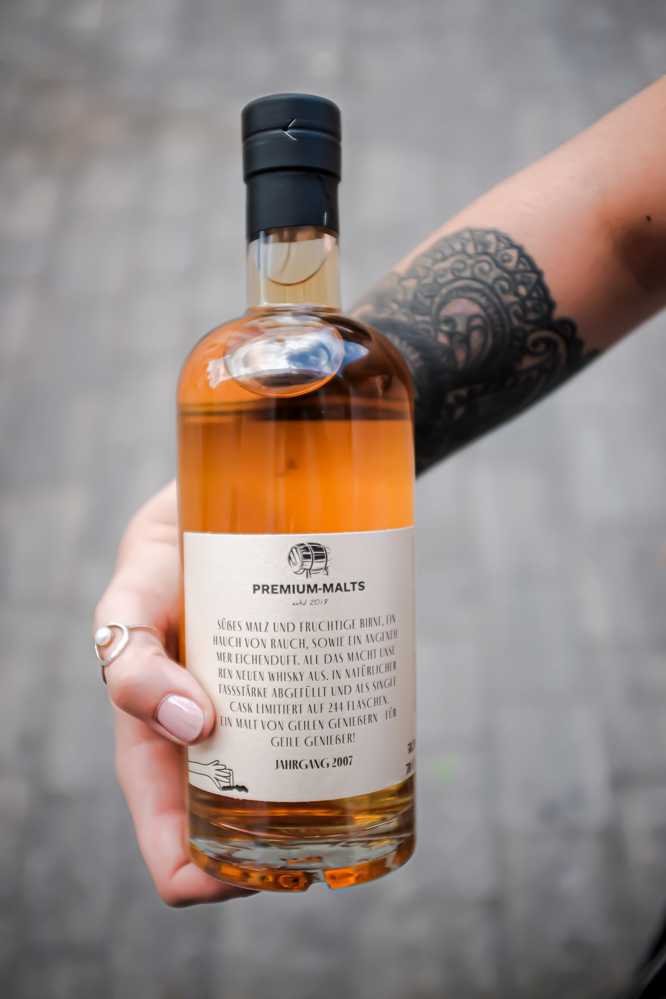
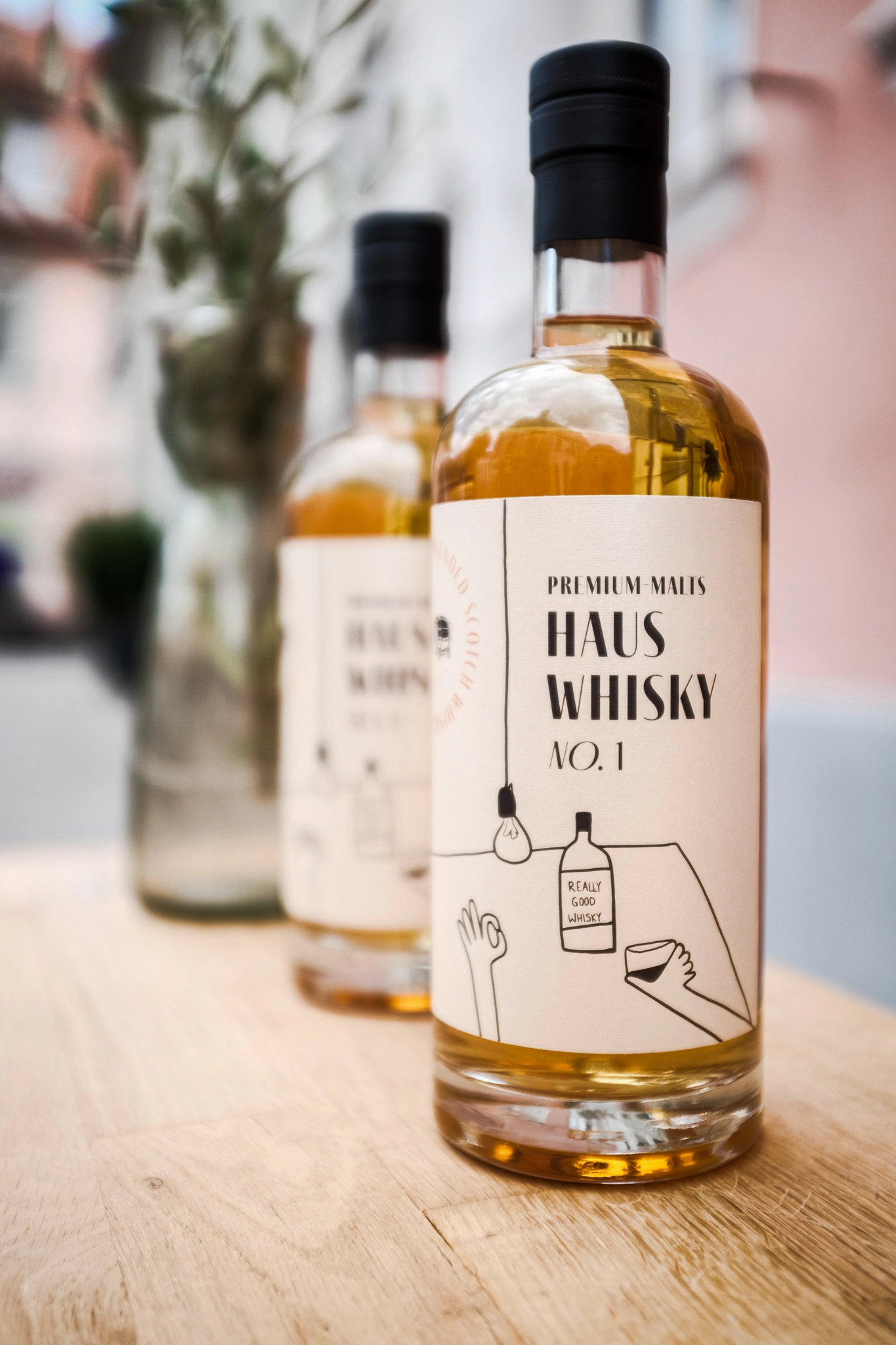
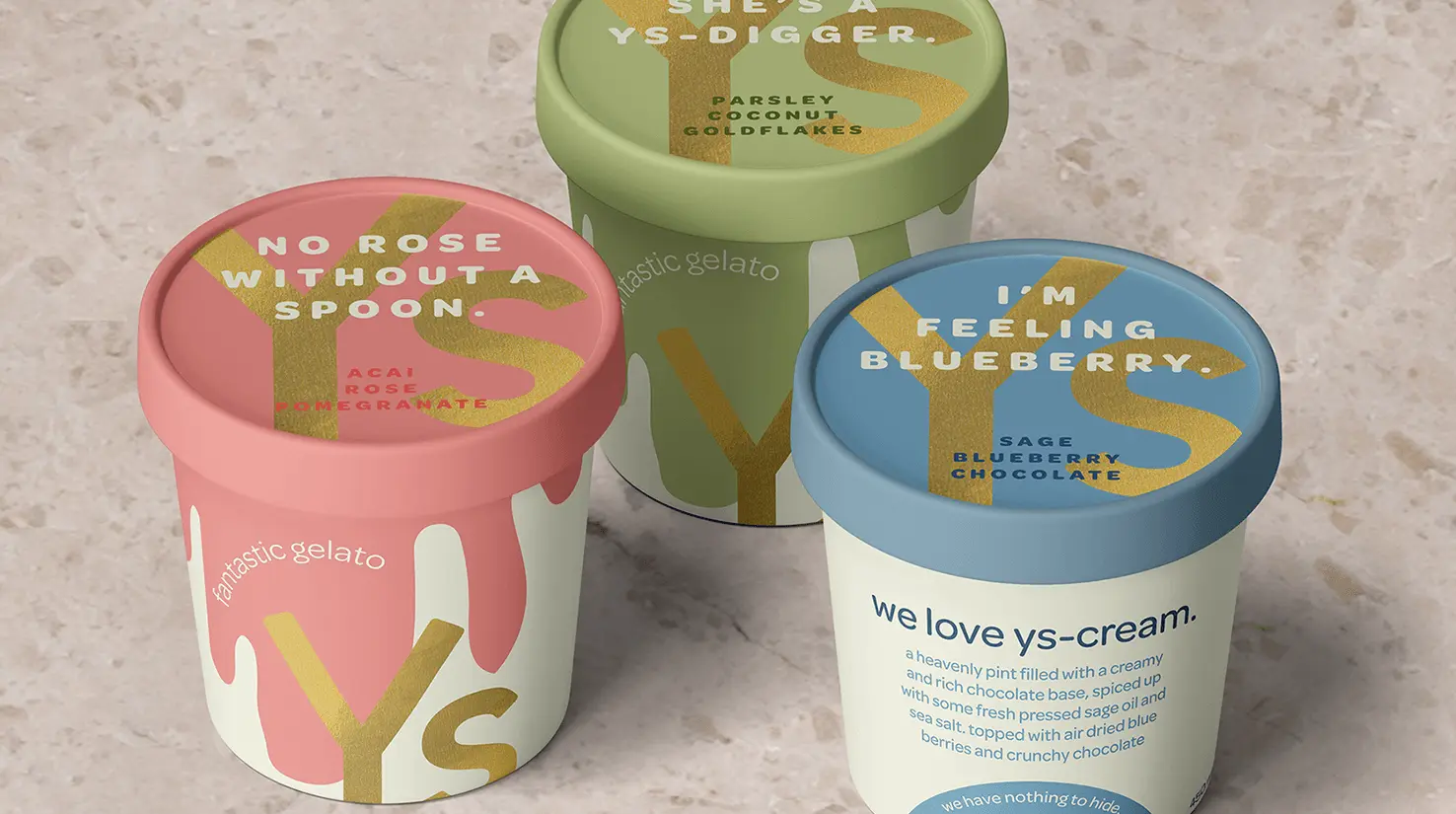
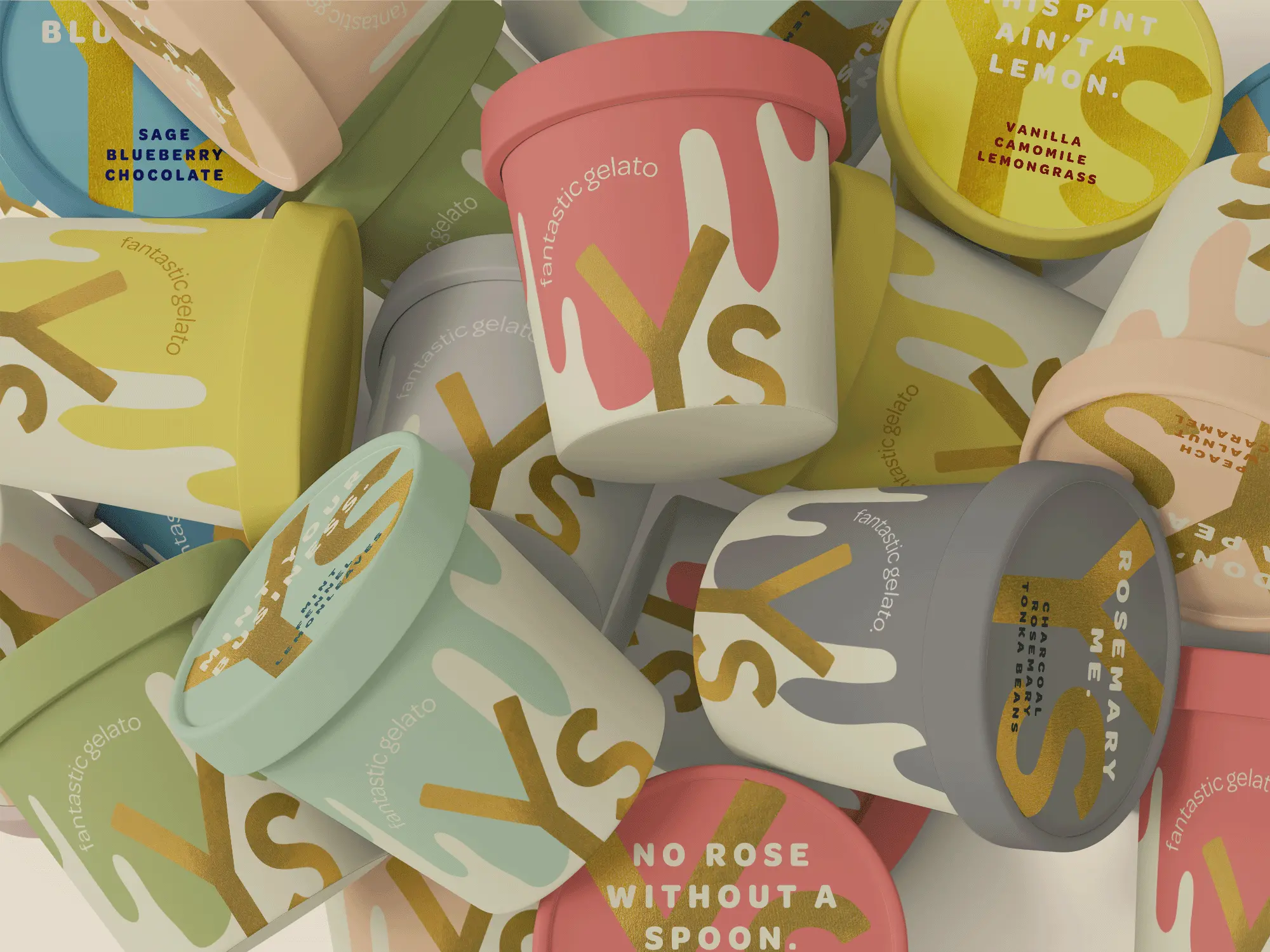
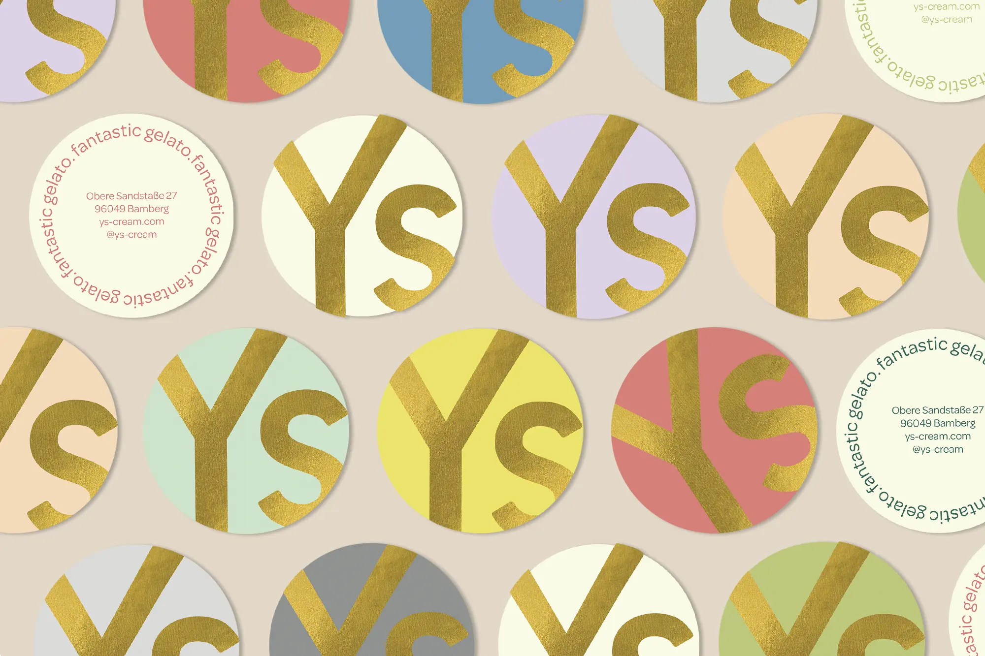
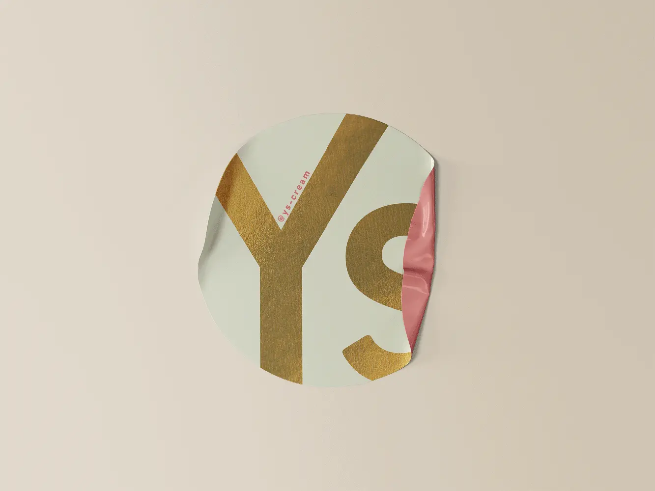
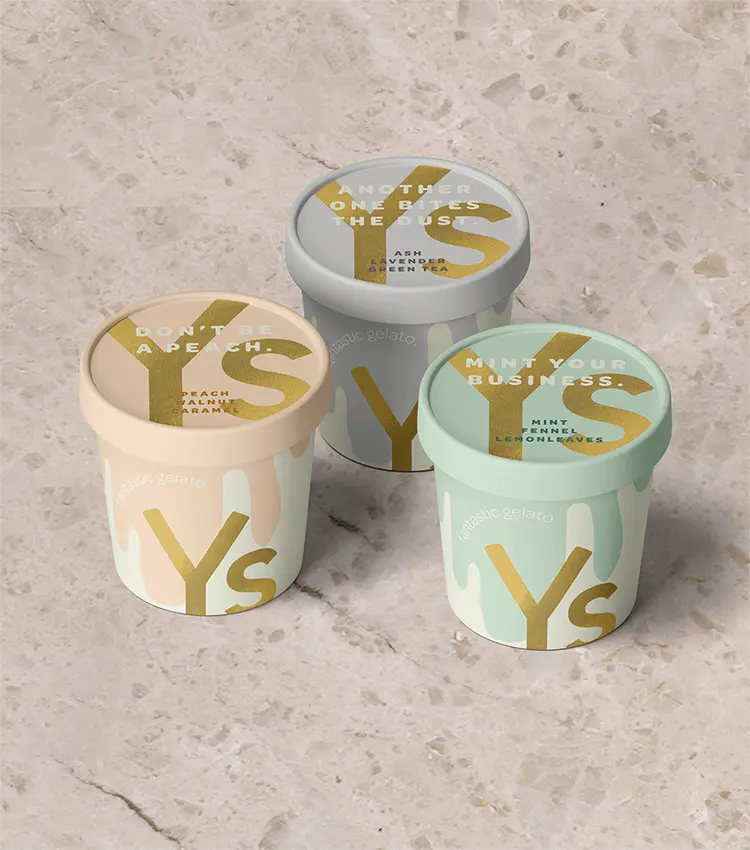
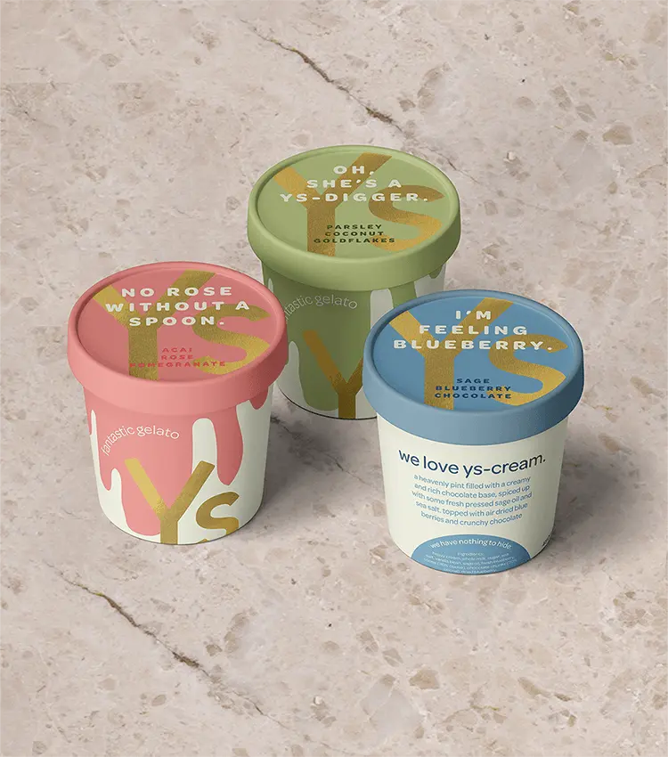
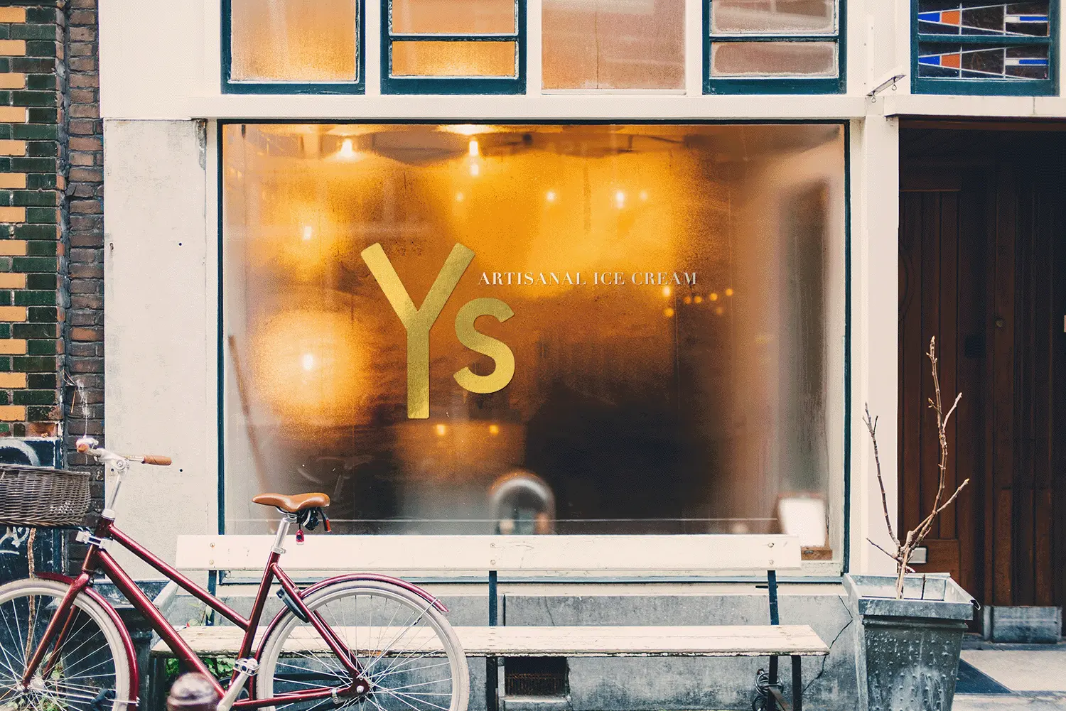
This young, high-quality ice cream concept is designed to be playful while maintaining transparency with consumers. The brand identity is versatile, allowing for seamless application across a wide range of merchandise, providing the client with flexibility and numerous opportunities for growth.
With a focus on aligning with the client’s vision for expansion, the design captures the essence of fun and quality, inviting customers to enjoy a delightful experience.
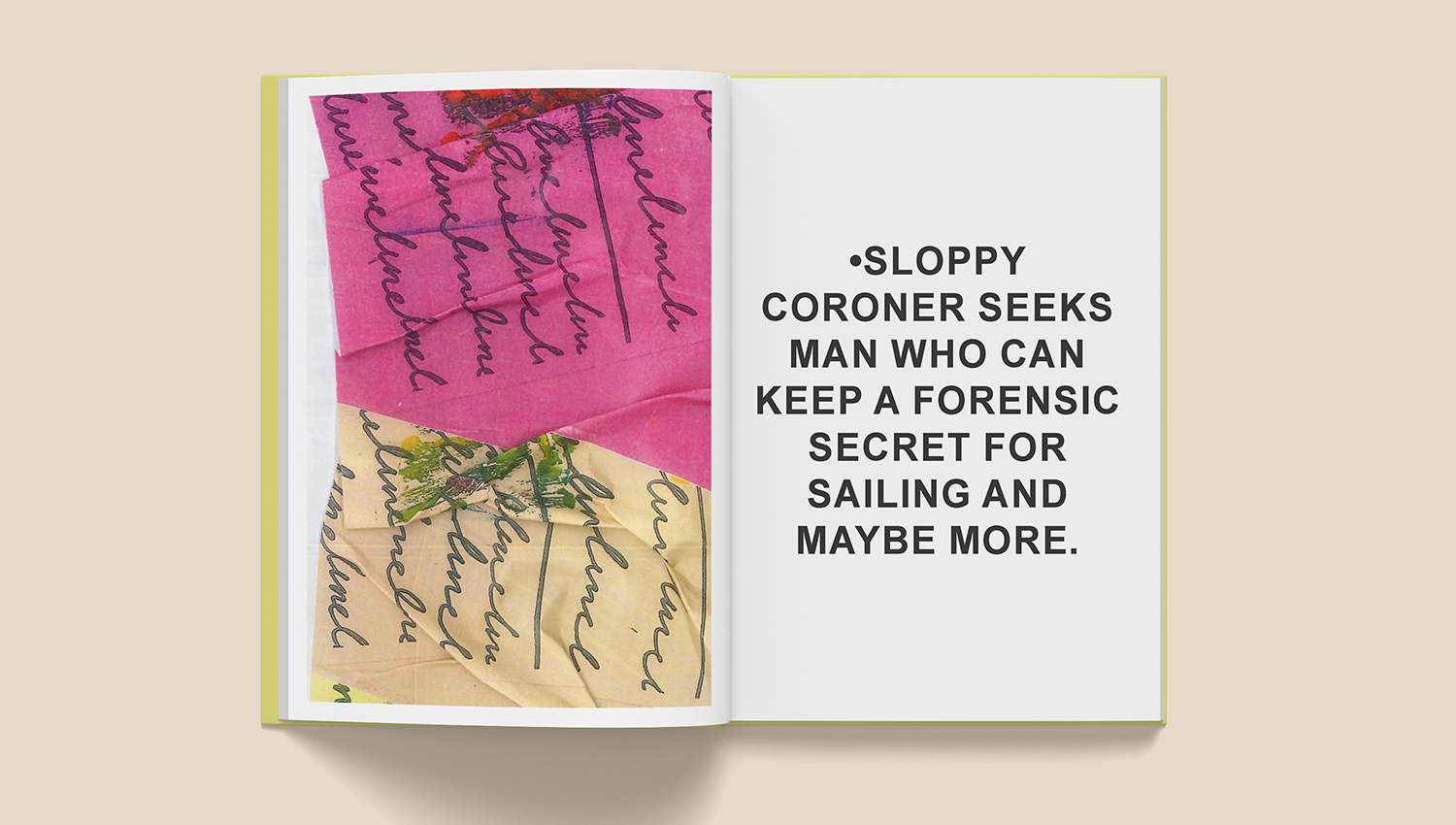
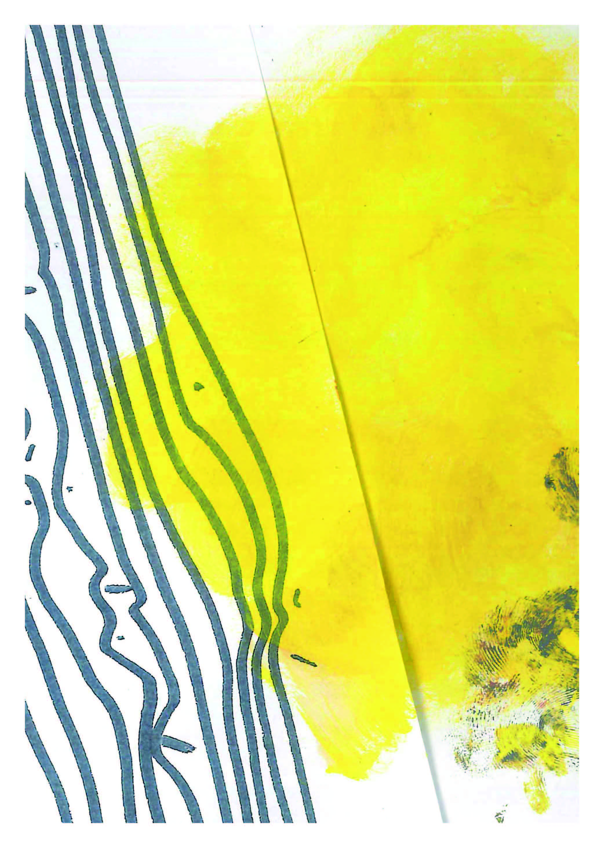
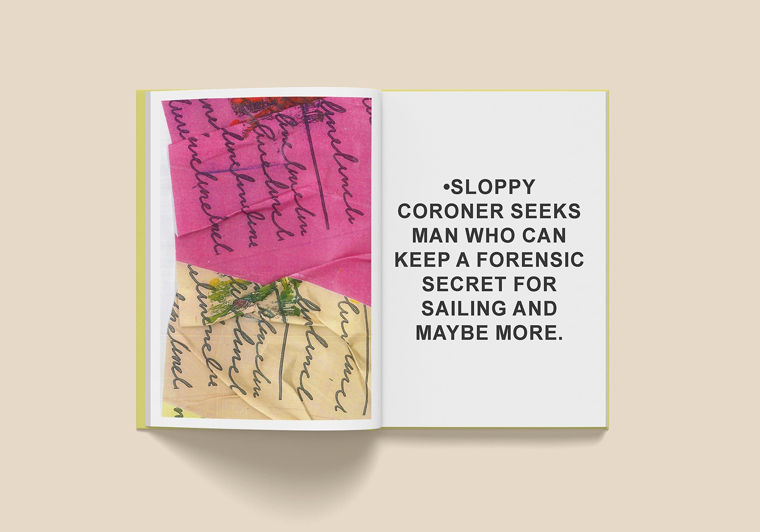
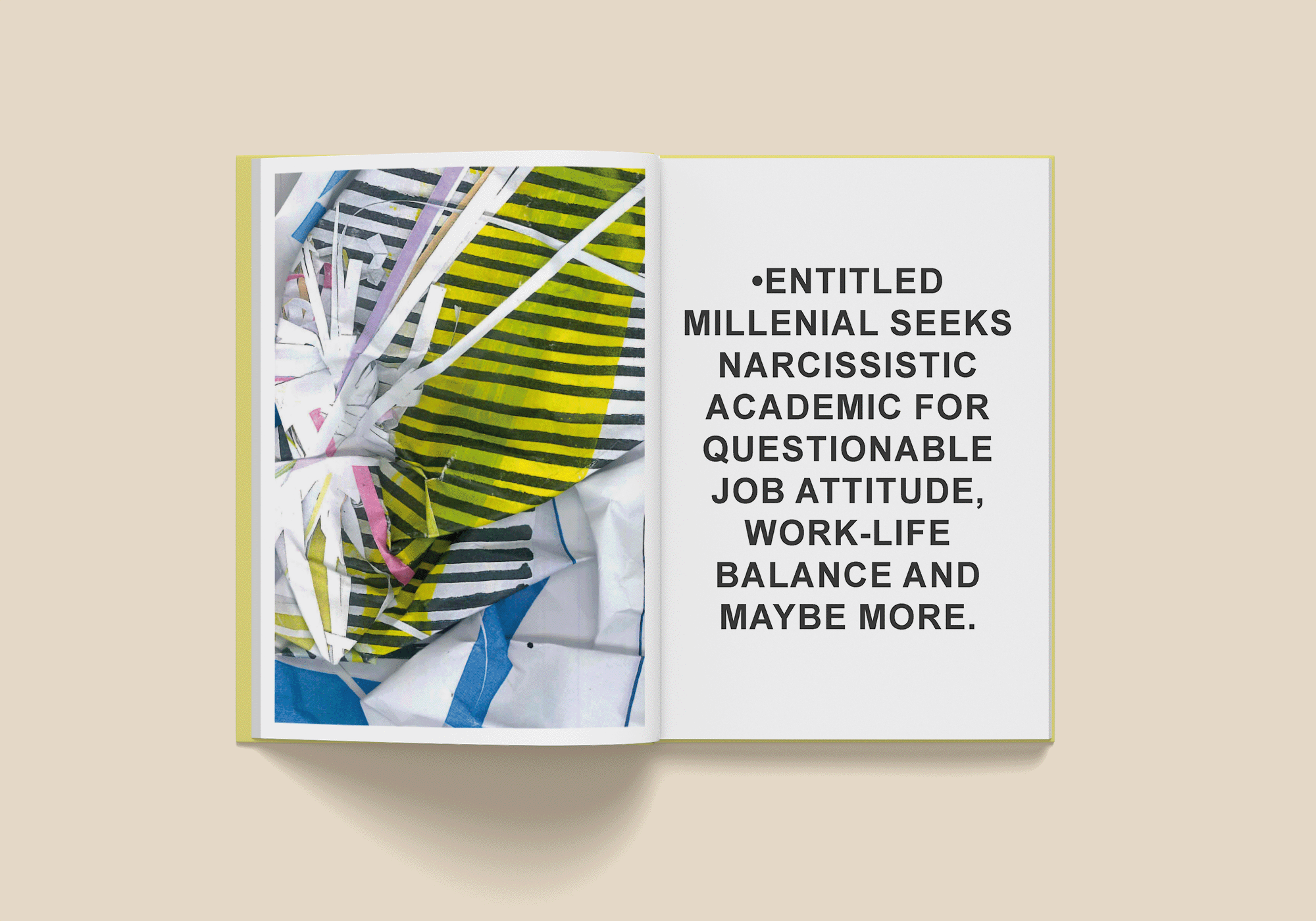
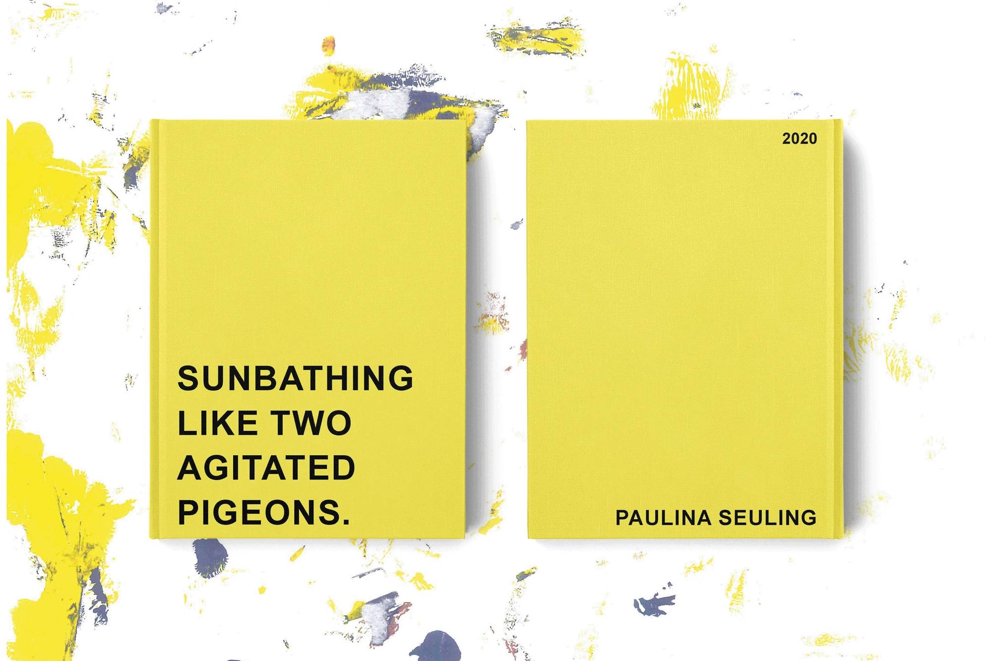
A visual art project that combines scanned collages with personal ads inspired by the classic syntax traditionally found in newspapers. To avoid conceiving something that could be considered ‚kitsch‘, inspired me to give the sentences a bizarre twist that reflects my personal humour.


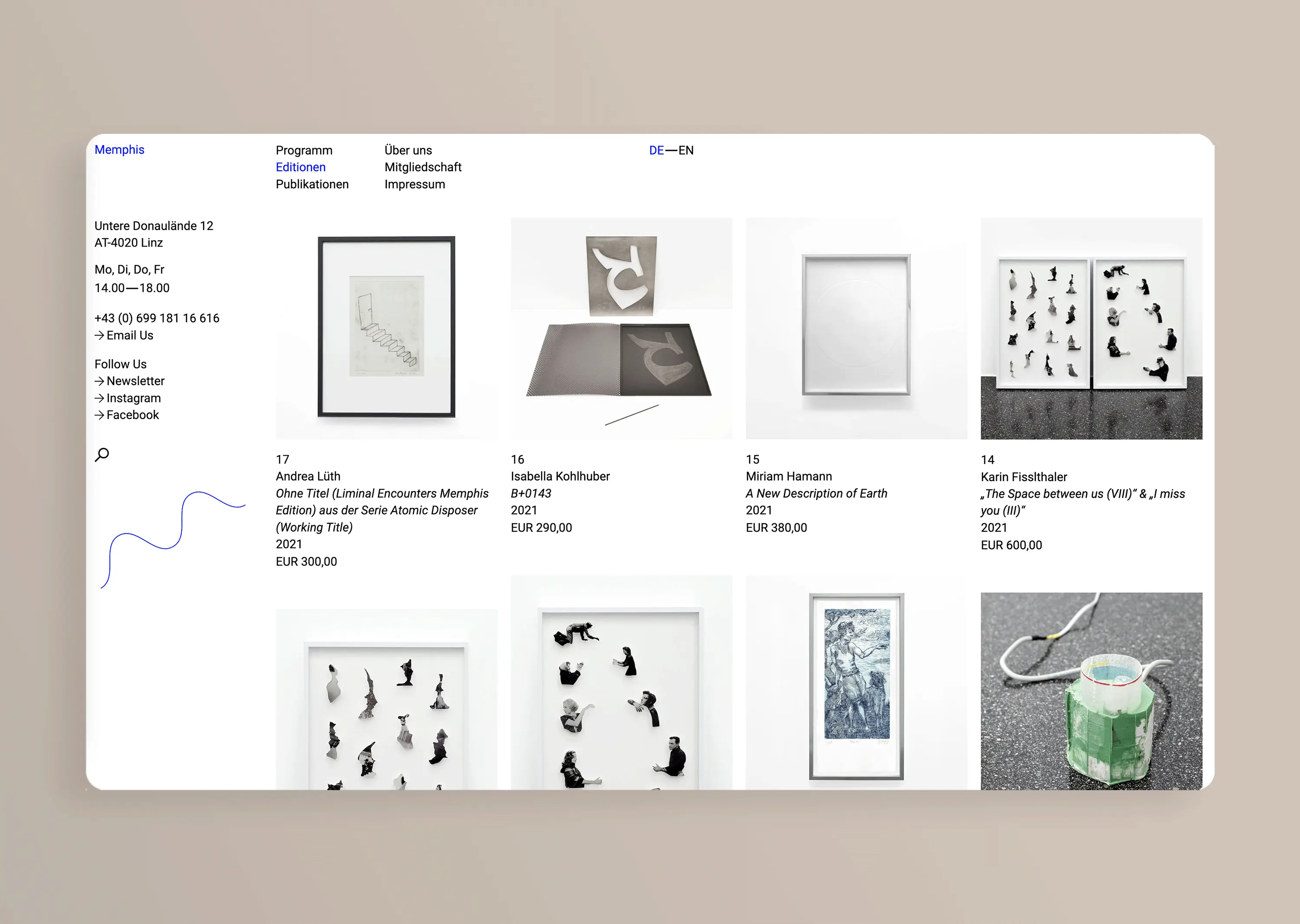
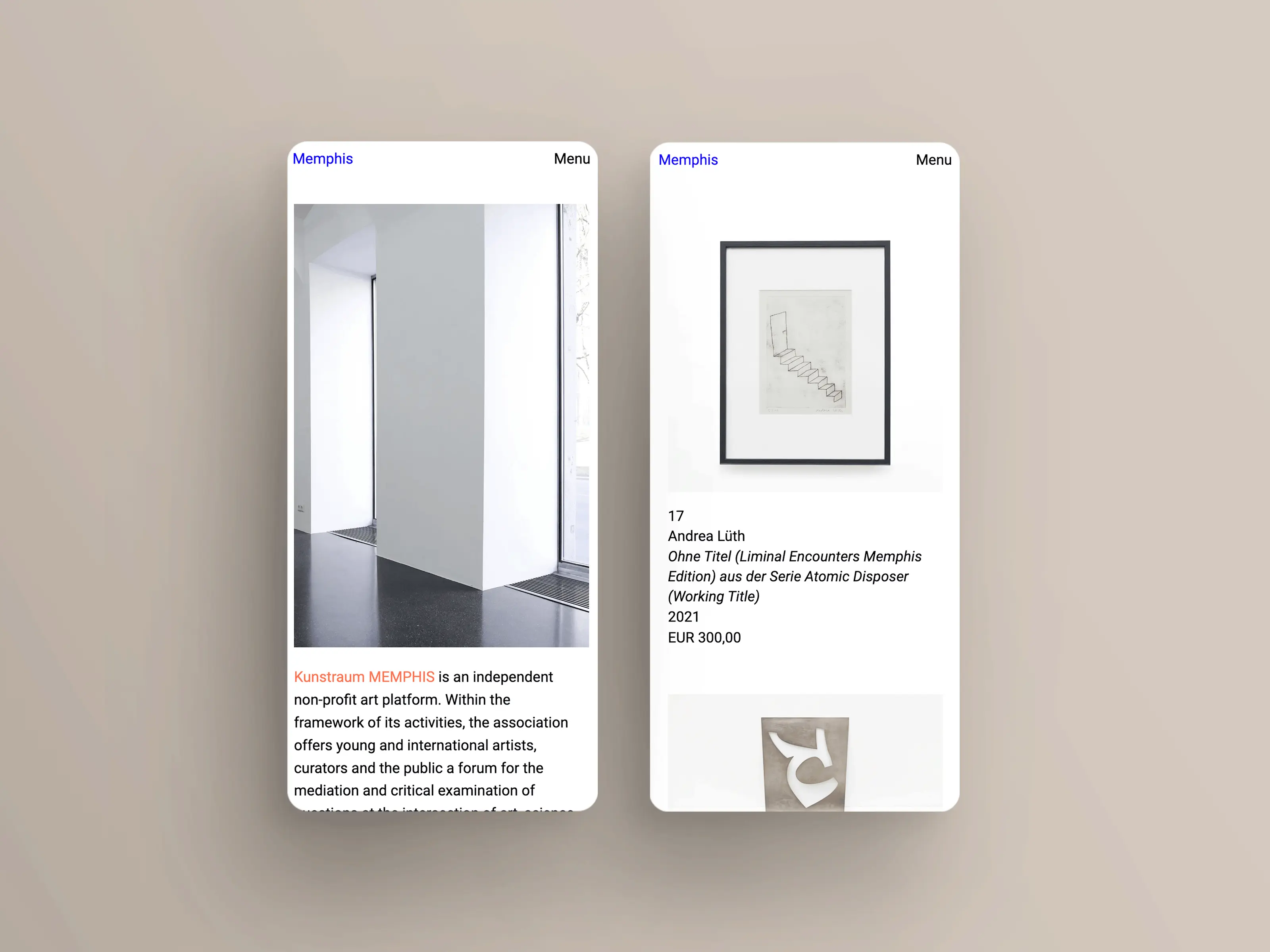
Kunstraum MEMPHIS is an independent non-profit art platform that connects young and international artists, curators, and the public to explore critical issues at the intersection of art, science, politics, and activism through exhibitions and events.
Given the vast quantities of visual content generated by its activities, Kunstraum MEMPHIS required an extensive content management system (CMS) to effectively handle and showcase this diverse material. The design solution focuses on creating a user-friendly interface that allows for easy navigation and exploration of the rich artistic landscape presented by the platform.
 Go to website

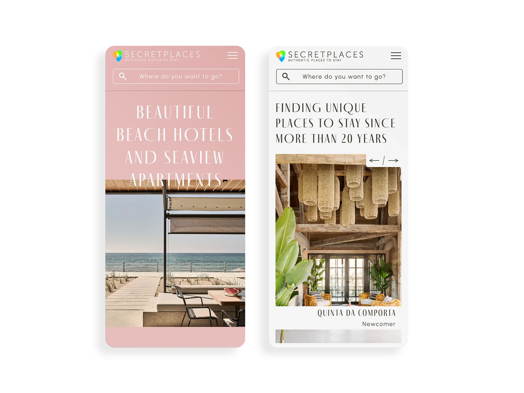
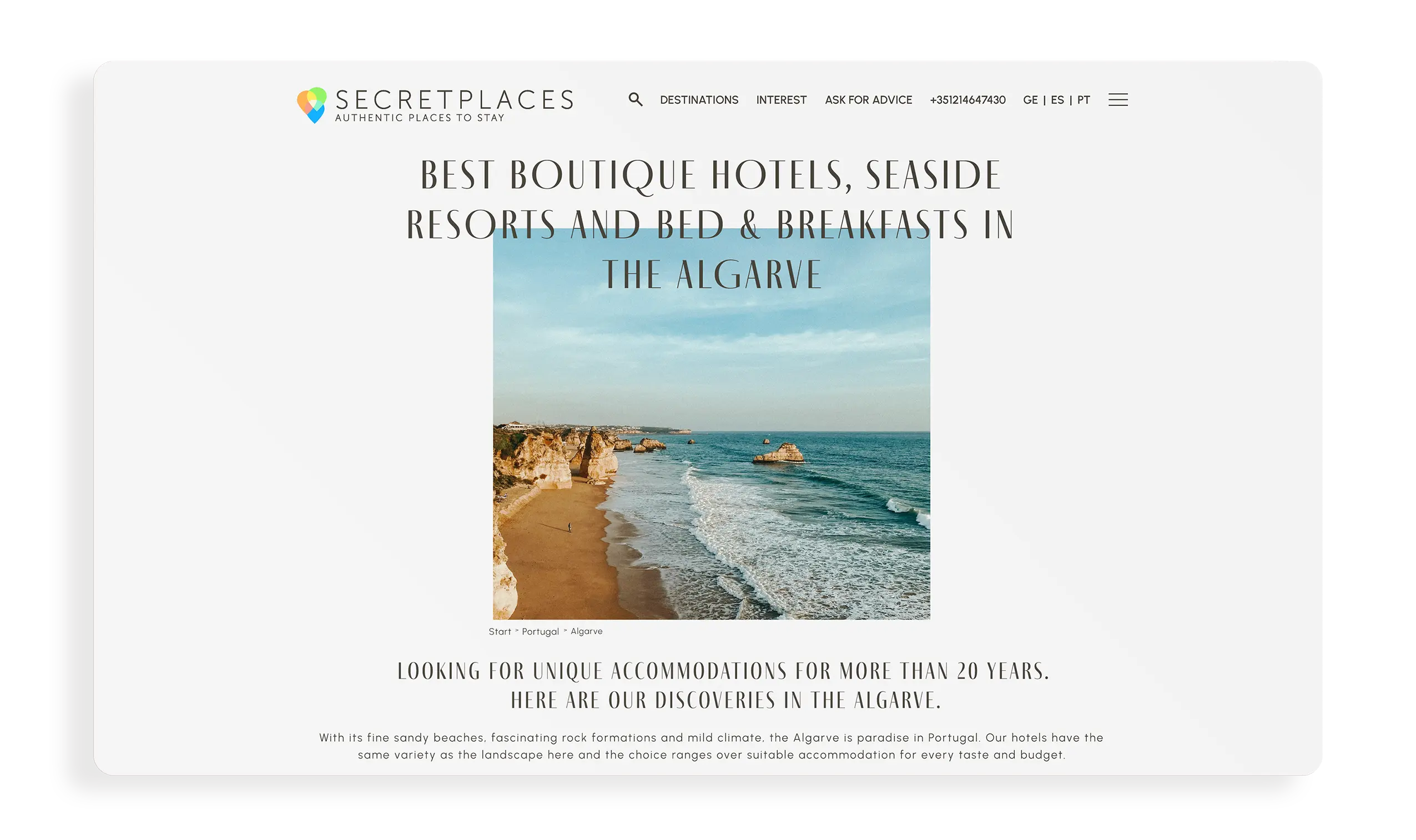
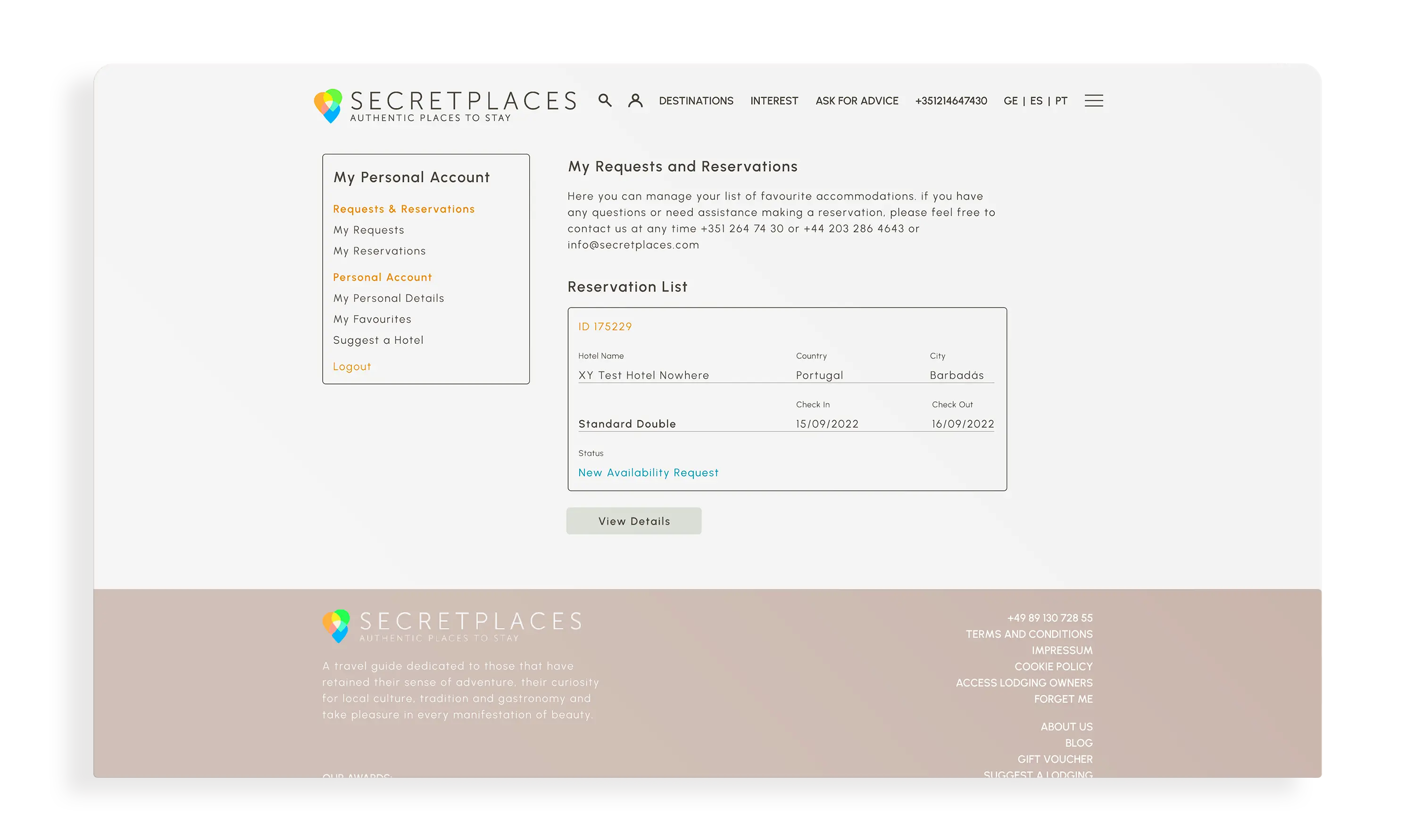
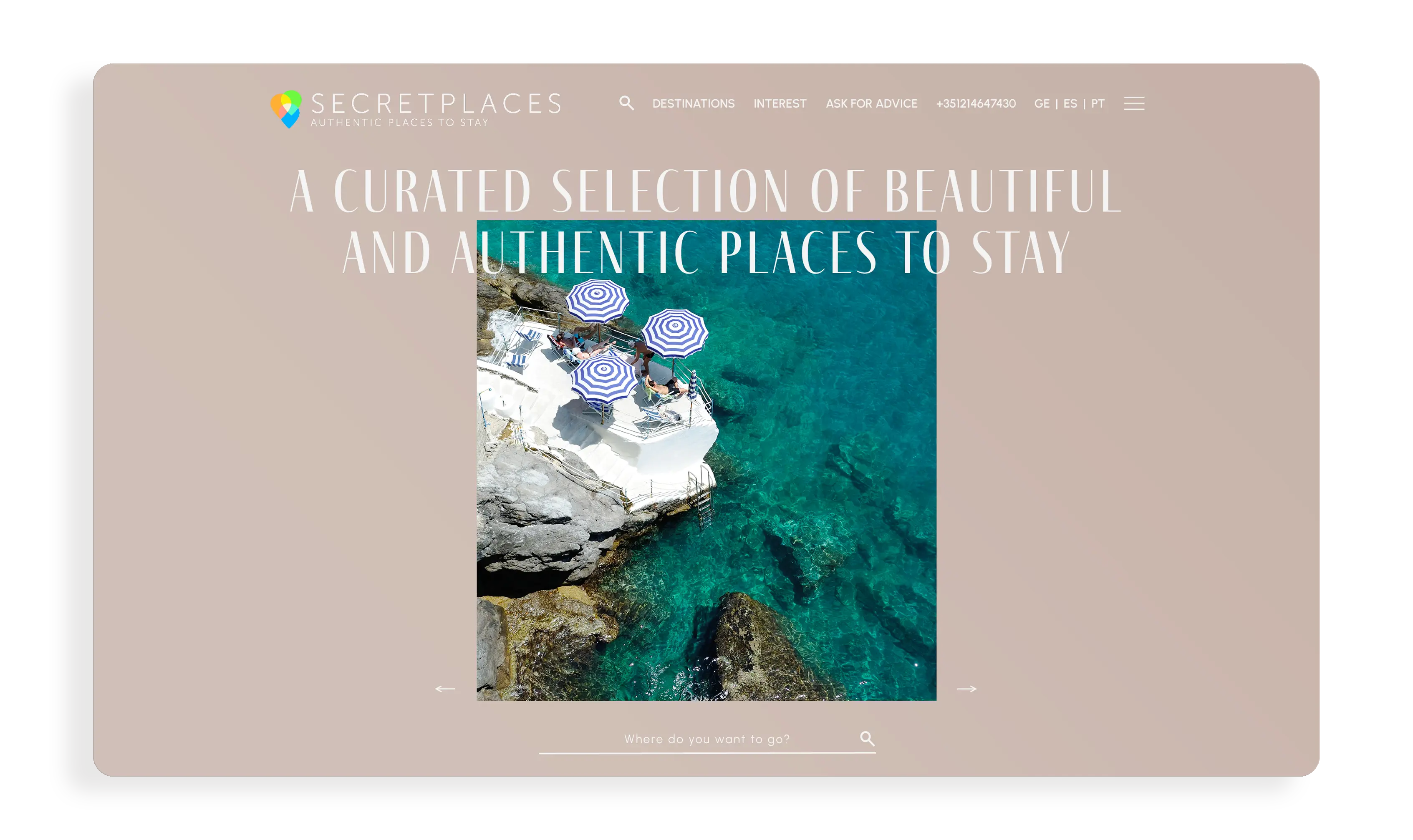
This travel guide is dedicated to adventurous souls who embrace their curiosity for local culture, tradition, and gastronomy. The design is young, timeless, and user-friendly, inviting readers to explore and discover more. With a focus on visually captivating layouts and engaging content, the guide encourages a sense of wanderlust and exploration. Thoughtful typography and vibrant imagery create an inviting atmosphere, making it easy for users to navigate through its pages and uncover hidden gems in their travels.
 Text Link
